10 Conversion Rate Optimization Hacks You Should Know
Stellar rankings? Great.
A massive influx of traffic? Even better.
Impressive audience retention? You’re on a roll.
But wait, what about your conversion rate?
As one of the most pivotal digital marketing metrics, your conversion rate can make or break your business.
It should come as no surprise that websites with a high conversion rate (11% or more) make winning sales and consistently dominate their industry.
Sounds like something you wouldn’t mind doing?
Well, we’re here to share our expertise and help you get there. In this blog, we’ll break down the basics and dive deep into the most effective conversion rate optimization hacks of 2021.
Let’s get started!
Engage, convert, repeat! Give your business a power-packed vitamin shot by signing up for our conversion rate optimization services.
Contents
Conversion Rate: What Is It and How Can I Calculate It?
How to Optimize Your Conversion Rate
- Speed Up Your Website.
- Use Chatbots to Your Advantage.
- Let Winning CTAs (Calls-to-Action) Do the Trick!
- Add Impactful Videos to Your Landing Page.
- Make Your USP (Unique Selling Proposition) Stand Out
- Sprinkle Some Good Ol’ Testimonial Magic on Your Site.
- Make the Checkout Process as Smooth as Possible.
- Don’t Skimp on Landing Page Design in the Least
- Leverage A/B Testing.
- Work on Your Site’s Mobile-Friendliness.
Conversion Rate: What Is It and How Can I Calculate It?
Let’s flip the pages and take a quick look at the basics before we get into the nitty-gritty of conversion rate optimization.
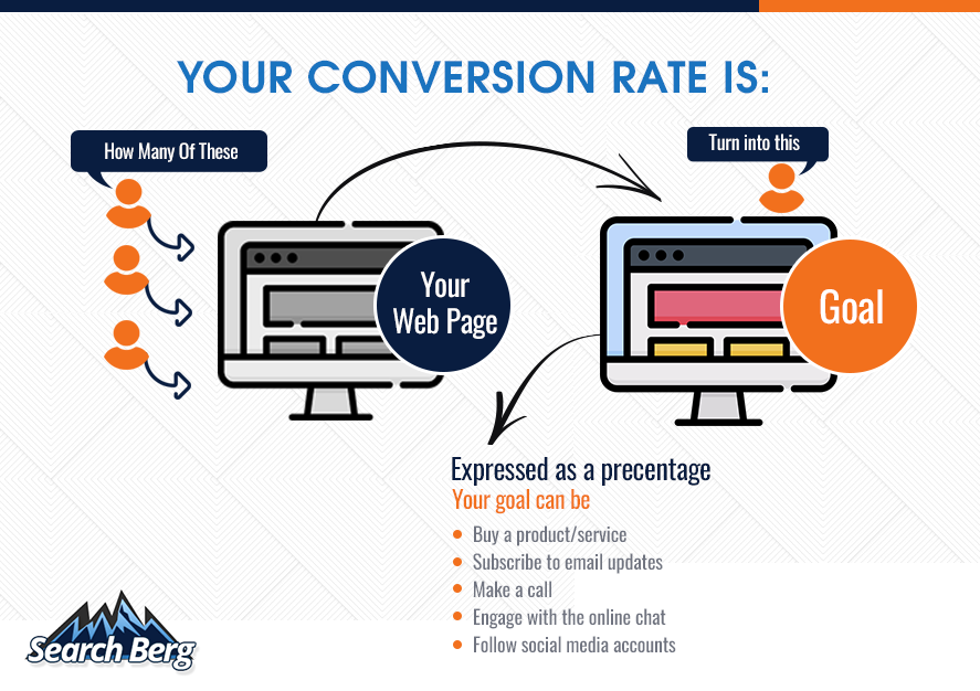
Your website’s conversion rate is defined as the percentage of web users who take a desired action.
Here’s a concept illustration that captures the essence of this process:

The higher your conversion rate, the better.
If it’s somewhere around 2.35%, there’s a lot of room for improvement.
If it’s 5.31% or higher, you’re doing pretty good.
And if you manage to make it to the big leagues (11% or higher), you’ve struck gold.
Start by calculating your conversation rate.
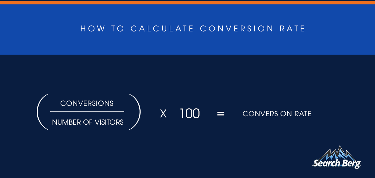
Once you know where you stand, you can take prompt measures to undo the damage. And that’s where conversion rate optimization (CRO) comes in.
As the process of increasing the percentage of web users who achieve a desired goal on your website, CRO helps you reorient your business towards long-term growth.
Not only will your revenue skyrocket, but your online visibility will also get a much-needed boost. In addition, you’ll manage to lower your customer acquisition costs, rank higher on SERPs, improve your brand identity, and become one of the go-to businesses in your niche.
Now that you have a good grasp on how CRO can benefit your brand, let’s cover more ground.
We’ve rounded up the top conversion rate optimization hacks to help you make bigger, better, and more sustained sales in 2021.
How to Optimize Your Conversion Rate
1. Speed Up Your Website
You’ve probably heard about the importance of page speed before. When it comes to improving your site’s conversion rate, speeding things up isn’t just important, it’s non-negotiable.
Why?
Well, every 100–millisecond delay in load speed can cause your conversion rate to drop by a whopping 7%.
In fact, 79% of web users refuse to shop from sites that take too long to load.
And if your site takes longer than two seconds to load, you can wave 53% of potential customers goodbye.
So, if you haven’t been prioritizing web performance, you may want to turn things around stat.
Start by figuring out where you stand. Use Google’s free tool, Page Speed Insights, to check whether your website passes the Core Web Vitals assessment.
Make sure you use both mobile and desktop modes.

Once you enter your website’s URL, you’ll receive a set of comprehensive statistics about the overall health of your website.
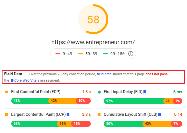
If you don’t pass the Core Web Vitals assessment, dive deeper.
A web development expert can help you get a good grasp on the specific improvements that need to be made, especially if you’re unsure about how to analyze the results.
As a rule of thumb, check the following page speed insights:
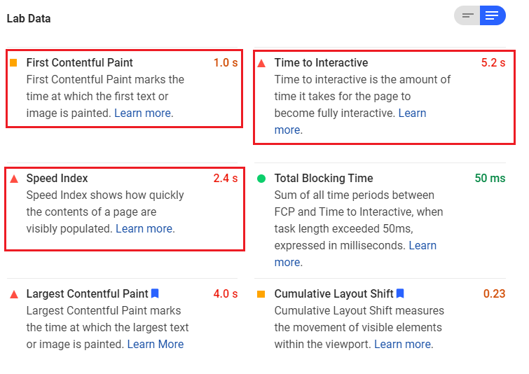
If the results are in red, you’re in the danger zone. In this case, that would be the Speed Index (2.4 s), the Time to Interactive (5.2 s), and the Largest Contentful Paint (4.0 s).
As you work with a web development expert, they’ll also analyze the performance of individual page URLs. This is a great way to detect certain pages that are bringing your score down.
As you scroll down, you’ll find a set of customized fixes that can help improve your site’s performance.
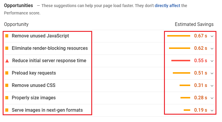
As you browse through the suggestions, you’ll get a glimpse of exactly how many seconds you can save by implementing them.
Pretty incredible, right?
As you make these fixes, you’ll manage to increase your conversion rate.
Incredible page speed. Even better conversions. Sounds like something your website needs? Our expert web development assistance is a form away!
2. Use Chatbots to Your Advantage
Smart.
Uber-helpful.
Quick.
Chatbots are rapidly transforming the modern website experience and we can’t say we didn’t see this one coming from miles away!
Within a few months of their introduction, chatbots were already being touted as the next big thing for CRO.
And their impact has been phenomenal, to say the least.
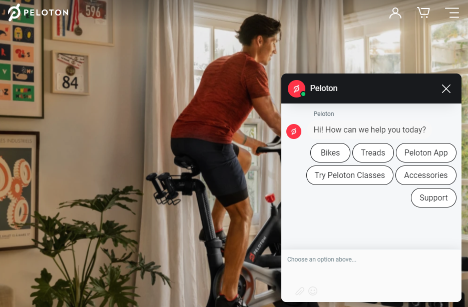
Today, millions of websites boast simple, speedy, aesthetically appealing, and non-disruptive chatbots.
Peloton’s visually refreshing and keyword-assisted chatbot is CRO at its best.
What makes chatbots so great?
Their ability to engage your audience from the get-go. By holding your audience’s attention from the second they land on your site, chatbots effectively reduce bounce rate.
And this is just their immediate impact.
When your website visitors get quick, personalized answers to their queries, they’re more likely to take an action, i.e., make a purchase, sign up for your newsletter, etc.
If your website doesn’t feature a 24/7 chatbot, you may want to jump on the bandwagon.
With an AI-powered chatbot, you’ll get nuanced insights into customer behavior. Over time, these insights can help you tailor your product/service range and customize your marketing strategies accordingly.
When incorporating a chatbot into your site, make sure you opt for clean and compelling design.
In addition, avoid sending multiple questions if people close the chatbot or refuse to engage with it.
Remember, a great chunk of your website visitors comprises old customers who already know what they want. The last thing they want is to disrupt their quick shopping experience with a persistent, unrelenting chatbot.
Once closed, the chatbot should remain closed until the web user’s next visit.
As you get this balance right, you’ll manage to swiftly improve landing page conversions like a seasoned pro.
Recommended Read: 10 Proven Tips to Drastically Reduce Website Bounce Rate
3. Let Winning CTAs (Calls-to-Action) Do the Trick!
If you’re looking to improve your conversion rate optimization strategy, you should have a razor-sharp focus on CTAs (calls-to-action).
A CTA is a short and compelling statement that prompts your audience to take an action on your site.
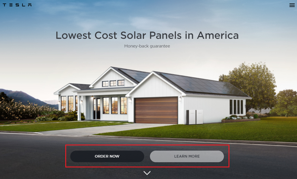
If you head over to Tesla’s website, you’ll notice that it’s replete with sharp, precise, and to-the-point CTAs.

And if you browse through Adidas’ engaging blogs, you’ll also notice that each post ends with a powerful CTA and product recommendation tabs.

The right CTA can help you keep visitors on your site for longer and maximize conversions.
Here’s how you can make the most of the power of CTAs.
Instead of solely incorporating them into your landing page, make sure you add them to the remaining webpages as well, especially your product/service pages, blogs, articles, infographics, etc.
As you support your content with compelling CTAs, you’ll manage to convert curious readers into active buyers.
Remember, get as creative as possible.
While short and simple CTAs can do the trick as well, make sure you think outside the box for specific landing pages or blogs that need extra oomph.
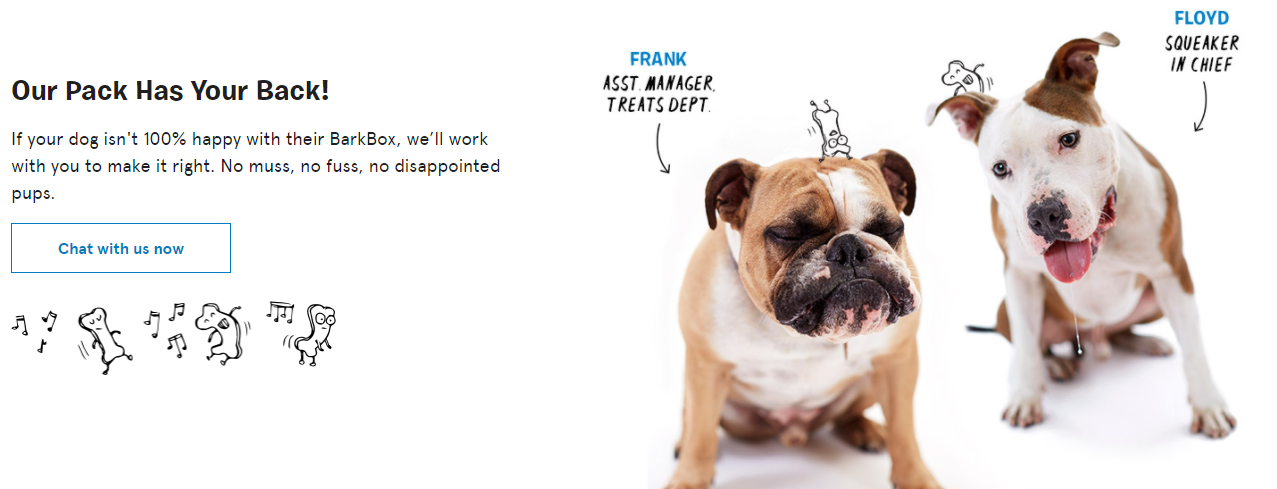
BarkBox’s witty CTA checks off all the boxes!
4. Add Impactful Videos to Your Landing Page
Did you know that adding a video to your landing page makes it 50 times more likely to appear among the top Google search results?
In fact, marketers who leverage videos increase revenue 49% faster than those who don’t.
The power of video content is undeniable.
And when it comes to conversion rate optimization, incorporating impactful videos into your website is your golden ticket to converting your way to big bucks.
Lacoste’s engaging landing page videos are quite a visual treat. Not only do they compel web users to stick around, but they also prompt them to click on the sneaky CTA conveniently placed at the bottom.
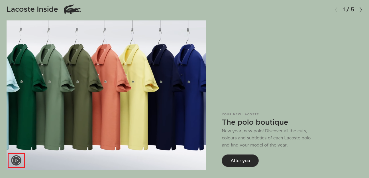
And if you take a closer look, you’ll notice that the video features a small pause/press button towards the bottom left.
This is a great way to allow web users to control the video.
In contrast, landing pages often feature videos that play on loop and cannot be intercepted. This is exactly what you shouldn’t be doing.
As you allow web users to pause or press the video at their own whim, you’ll manage to earn a conversion and avoid leaving them frustrated.
5. Make Your USP (Unique Selling Proposition) Stand Out
Struggling to increase web conversions? There’s a high chance that you’re not highlighting your USP (unique selling proposition) like you should.
If you take a quick look at Target’s website, you’ll notice that almost all of their landing pages feature their USPs.

If you’re still confused about your brand’s USP(s), dive deeper.
What would compel your audience to shop with you instead of your competitors?
What makes you stand out?
In essence, what gives you an edge over your competition?
Perhaps you offer same-day delivery. Or maybe you offer the lowest possible quotes for home insurance in your area.
As you get a better grasp on your USPs, start incorporating them into your website.
Get creative like HelloFresh! Transform your USPs into eye-catching concept illustrations:
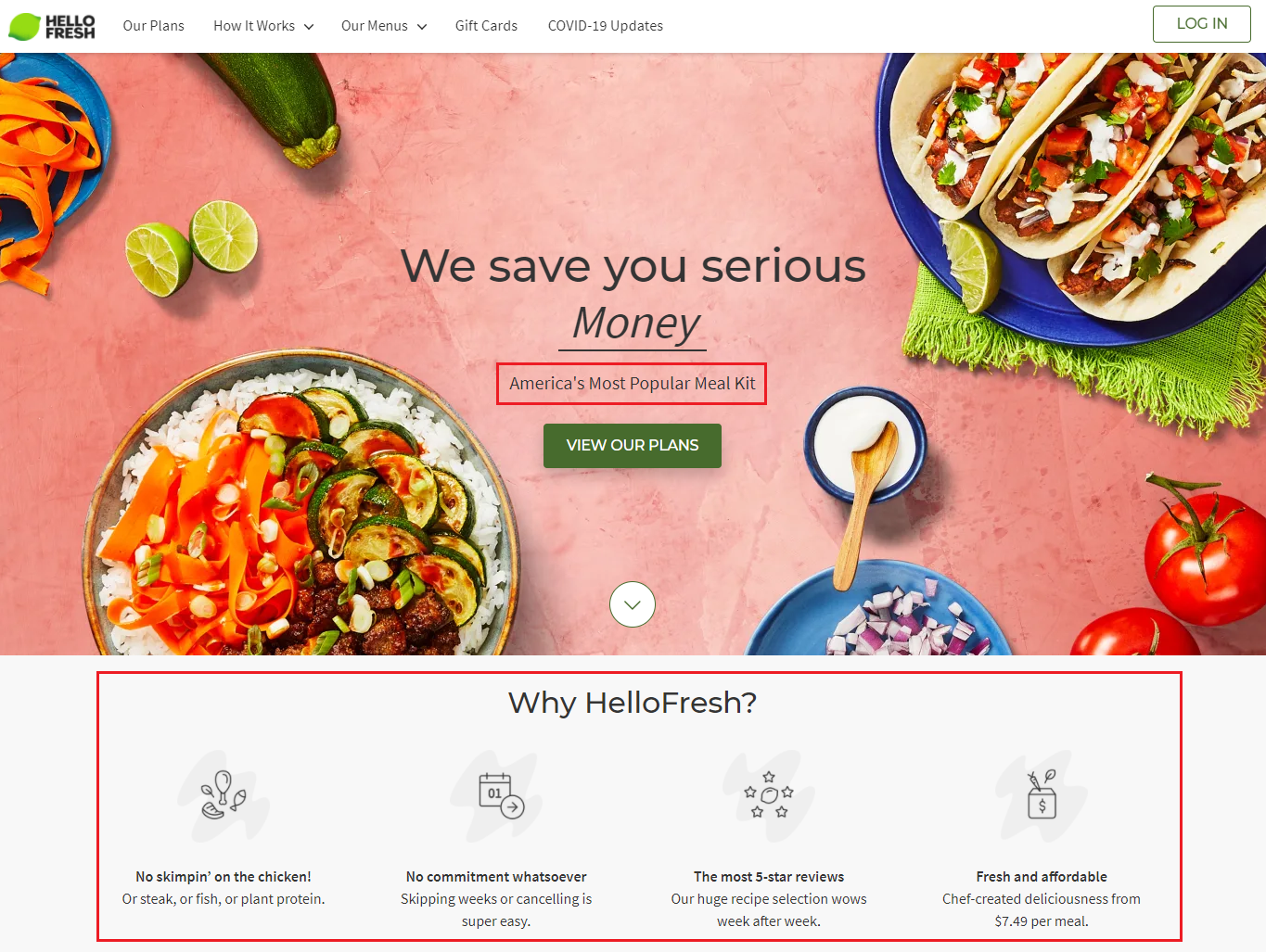
Make sure you pair your USPs with compelling CTAs. As you get this balance right, you’ll increase your online store’s conversion rate by leaps and bounds.
Like always, avoid overdoing it.
While incorporating your USPs into your website is important, you don’t want to feature a single USP multiple times on the same page.
Stick to moderation, and you’ll marvel at the impressive results.
6. Sprinkle Some Good Ol’ Testimonial Magic on Your Site
According to research, an astounding 92% of people read testimonials when shopping online.
And that’s not all.
As much as 80% of web users trust online reviews as much as personal recommendations.
Sure, your Google 3-Pack features a bunch of impressive reviews and your website features a separate testimonial page.
While these measures may sound like they’re enough, they’re not.
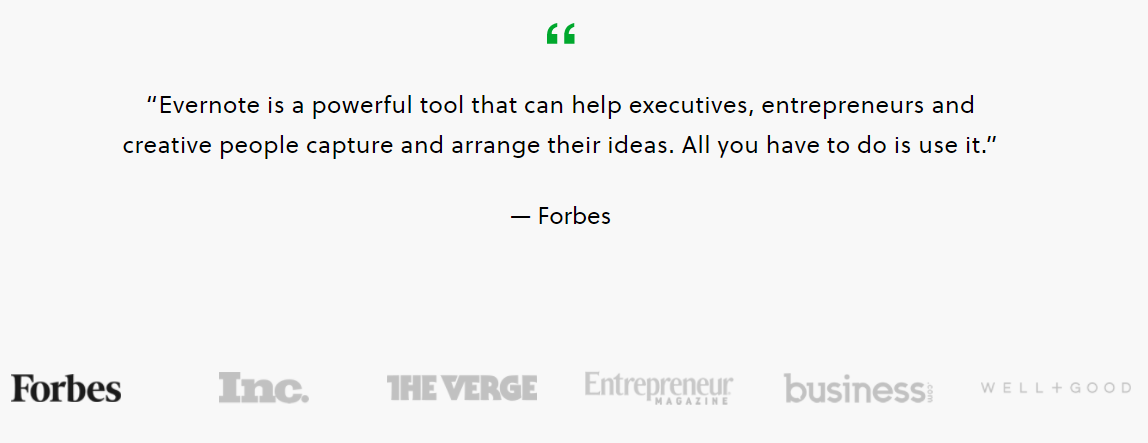
If you take a quick look at Evernote’s home page, you’ll notice that it features a bunch of powerful testimonials from industry giants like Forbes, Well + Good, Inc. Magazine, The Verge, Entrepreneur Magazine, etc.
Here’s a snippet:
 ChowNow’s home page is also replete with impressive online reviews:
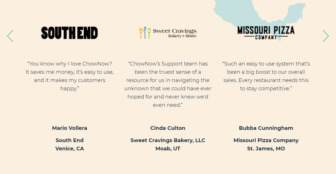
As web users engage with flattering reviews, they’re more likely to take an action on your site.
Each review acts as a vote for your business.
The more the votes, the better the conversions!
If you haven’t earned notable reviews from industry giants, you don’t have to skip this strategy altogether. Your home page can also feature testimonials from customers.
The kind of reviews you choose to display largely depends on whether you run a B2B or B2C business.
At the end of the day, you have free rein. Feature professional and/or customer reviews to give your business an edge and increase conversions.
Recommended Read: 8 Reasons to Protect Your Brand’s Online Reputation During the COVID-19 Pandemic
7. Make the Checkout Process as Smooth as Possible
If your site’s checkout process is too complex, you could easily lose hundreds of potential conversions.
And by complex, we mean anything ranging from tricky navigation to long-drawn-out checkout.
If you’re looking to increase the conversion rate for your e-commerce business, make sure your website offers a simple, smooth, and quick checkout process.
Here’s how you can turn things around.
Start by opting for straightforward, minimalistic, and user-friendly navigation.
Avoid requesting unnecessary information that could potentially delay checkout.
In addition, cut down on the number of pages that appear before the checkout process ends.
These simple fixes will help you speed up the checkout process and, in turn, increase your online store’s conversion rate.
8. Don’t Skimp on Landing Page Design in the Least
A whopping 94% of first impressions have to do with your website’s design.
In fact, approximately 75% of website credibility is attributed to its aesthetic appeal.
If your landing pages are poorly designed, your conversions will take a big hit.
And the last thing you want is to lose conversions because your website simply didn’t look the part. As an easy fix, web design isn’t worth losing potential sales over.
Start by creating a unique color palette for your brand. Not only will this help you optimize your conversion rate, but it’ll also play a big role in crystallizing your brand identity and increasing brand recall.
If you browse through Target’s landing pages, you’ll notice that they’ve incorporated their signature color—deep red—into the navigation, thumbnails, text, and concept illustrations.
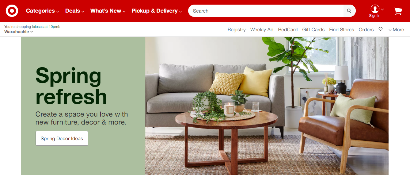
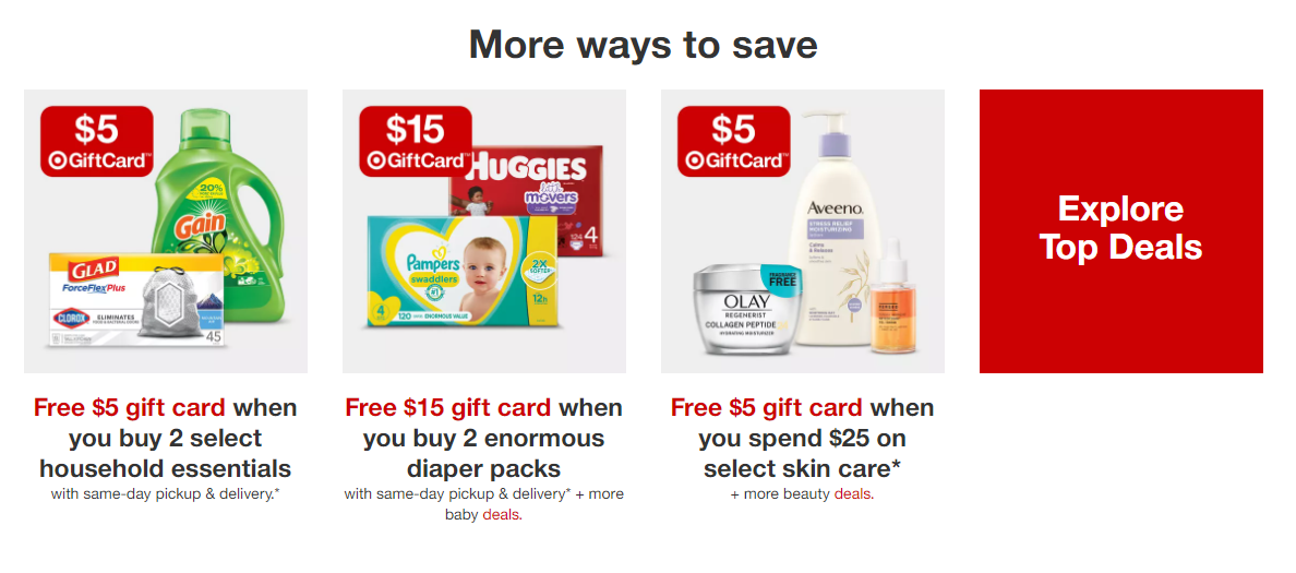

Their web design is clean, modern, fresh, and in line with their classic color scheme.
This is exactly what you want to do!
Apart from using your brand’s signature colors, use high-quality images and visuals to catch your audience’s attention.
A minimalistic—albeit unmistakably engaging—website will give your conversions a much-needed boost!
9. Leverage A/B Testing
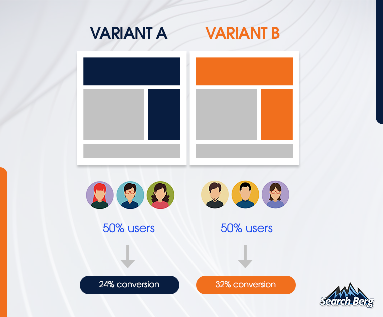
Conversion rate optimization and A/B testing go hand in hand.
Converting uninterested or casually interested visitors into enthusiastic buyers isn’t a straightforward process.
It requires a lot of experimentation.
This is where A/B testing comes in handy.
Also known as split testing, A/B testing is a technique that relies on comparing two versions of the same web page to determine which one does better.
This strategy can help you equip your website with CTAs, content, navigation, offers, headlines, and related web elements that outperform other variants.
In essence, it’s a trial-and-error boon that helps you uncover the crème de la crème of web elements.
Needless to say, A/B testing works wonders for CRO.
Start by identifying the unique elements you’re interested in testing. Once you have a rough list ready, sort it based on importance.
Start by tackling the first element.
Let’s say you’re working on the CTAs for your home page.
Create a “control” (the original version) and a “challenger” (the altered version).
Make sure you randomly select your sample to avoid distorting the results.
Test both variations and carefully analyze the results.
Based on the outcome, you may choose to stick to the “control” or go with the “challenger.”
While it may seem small, this change will heavily impact your conversions. Continue to leverage A/B testing in the long run!
10. Work on Your Site’s Mobile-Friendliness
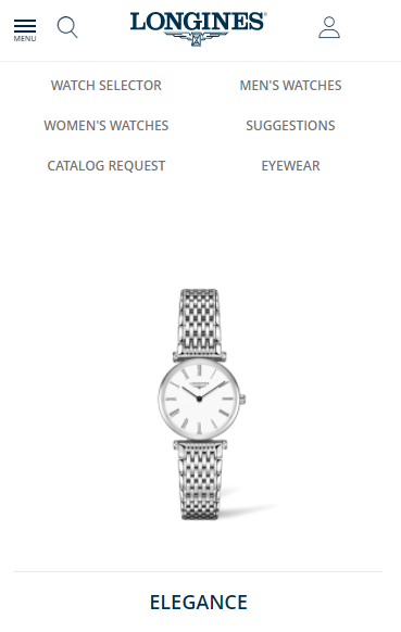
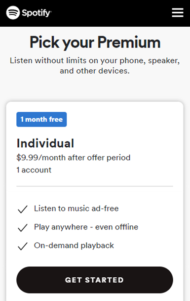
A whopping 61% of customers are more likely to shop from mobile-friendly websites.
And it’s easy to see why.
Unlike desktop computers, laptops, and tablets, mobile phones are extremely practical. Owing to their portability and convenience, they’re the go-to device for millions of people across the globe.
If your website isn’t mobile-friendly, you’re losing a massive amount of conversions.
And as mobile phone usage continues to skyrocket in 2021, opting out of mobile-friendliness can do tremendous damage to your revenue reports.
Execute a winning mobile-friendly website that offers seamless navigation, looks like a visual treat, and loads quickly.
In addition, make optimization a priority.
As you engage smartphone users, you’ll watch your conversions steadily rise and continue to rise.
Wrapping Up!
In this blog, we walked you through the top conversion rate optimization hacks for 2021.
If you’re ready to put these strategies into action, we’re here to help!
Our conversion rate optimization services are designed to help you bring in more qualified leads and optimize your entire sales funnel. We’re sticklers for attention-to-detail, so you know you’re in great hands!
By engaging potential customers at every step of their journey, we help you convert your target audience in abundance.
The outcome? Massive sales that don’t show any signs of slowing down.
Get started today!

