10 Proven Tips to Drastically Reduce Website Bounce Rate
Contents
- Give Your Website a Makeover.
- Simplify Navigation.
- Add More CTAs to the Homepage and Landing Pages.
- Improve Your Website’s Speed to Lower Bounce Rate.
- Make Sure Your Content Is “Readable”.
- Use High-Quality Images and Videos to Make a Stellar Impression.
- Steer Clear of Popups.
- Create Purposeful Content.
- Prioritize User-Friendliness and Mobile-Friendliness.
- Targeted Keywords.
What is a Good Bounce Rate? The Good, The Bad, and The Ugly.
You’ve created engaging and compelling web content.
Your blog is updated on a weekly basis.
In fact, you went the extra mile and invested in PPC marketing to increase web traffic and sales.
And yet, you’re struggling to keep customers on your website; the leads aren’t great; and the email signups are at a bare minimum.
Chances are, you’re dealing with a high bounce rate.
What Is Bounce Rate?
Now, for most digital marketers, bounce rates are a mystery.
According to Google:
“A bounce is a single-page session on your site. Bounce rate is the percentage of all sessions on your site in which users viewed only a single page and triggered only a single request to the Analytics server.”
It’s a pretty simple formula:
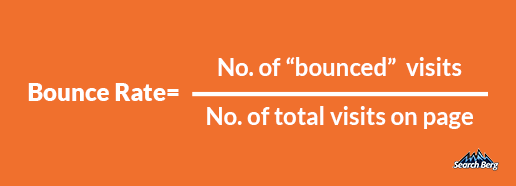
So, what does a bounce rate indicate? Why is your bounce rate so high? And how do you lower your bounce rate?
A high bounce rate means your website failed to convince the user to perform an action (this could mean sign up for a new service, buy a product, book an appointment, etc.). It could also indicate a poor user experience.
Reducing your site’s bounce rate could help you boost conversion rate significantly. So what are the things you can do to improve bounce rate?
How To Improve Bounce Rate: 10 Tips That Work!
1. Give Your Website a Makeover
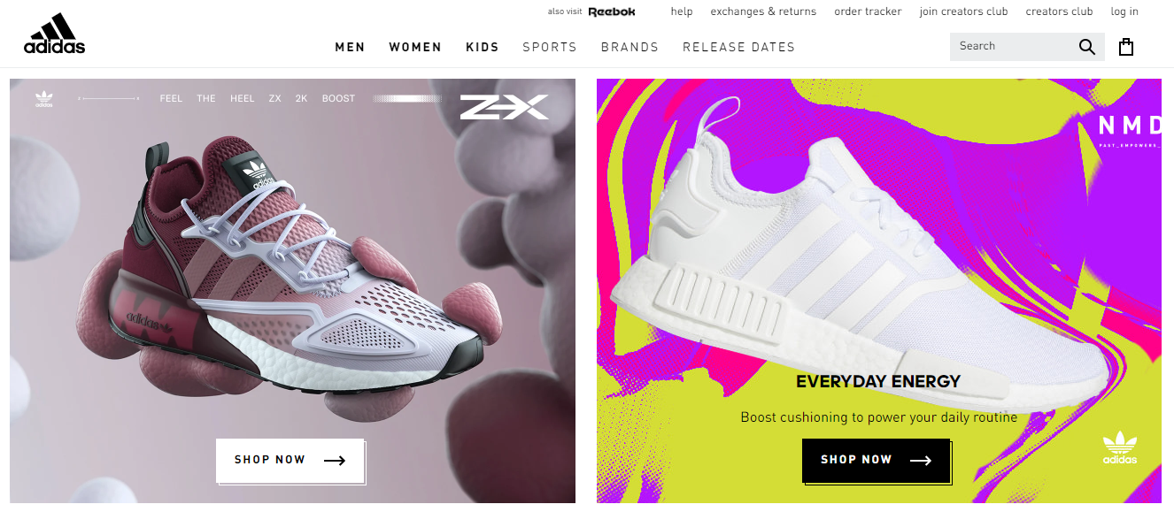
Would you consider investing in bleak and unimpressive wall art for your home? Probably not.
How about splurging on a coffee table book with an uninspiring and tattered cover? Doesn’t sound like a great idea, does it?
Aesthetic appeal matters. If your web design isn’t visually exciting, engaging, and impressive, web users will scram stat.
According to research, humans now have an average attention span of a measly eight seconds. You have approximately eight seconds to make a winning impression on web users who stumble across your website.
If your site takes a little too long to load, features complex navigation, or has an off-putting layout, it goes without saying that potential customers will bid you adieu before you know it.
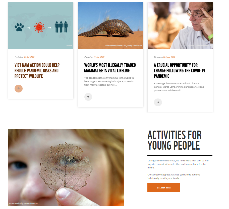
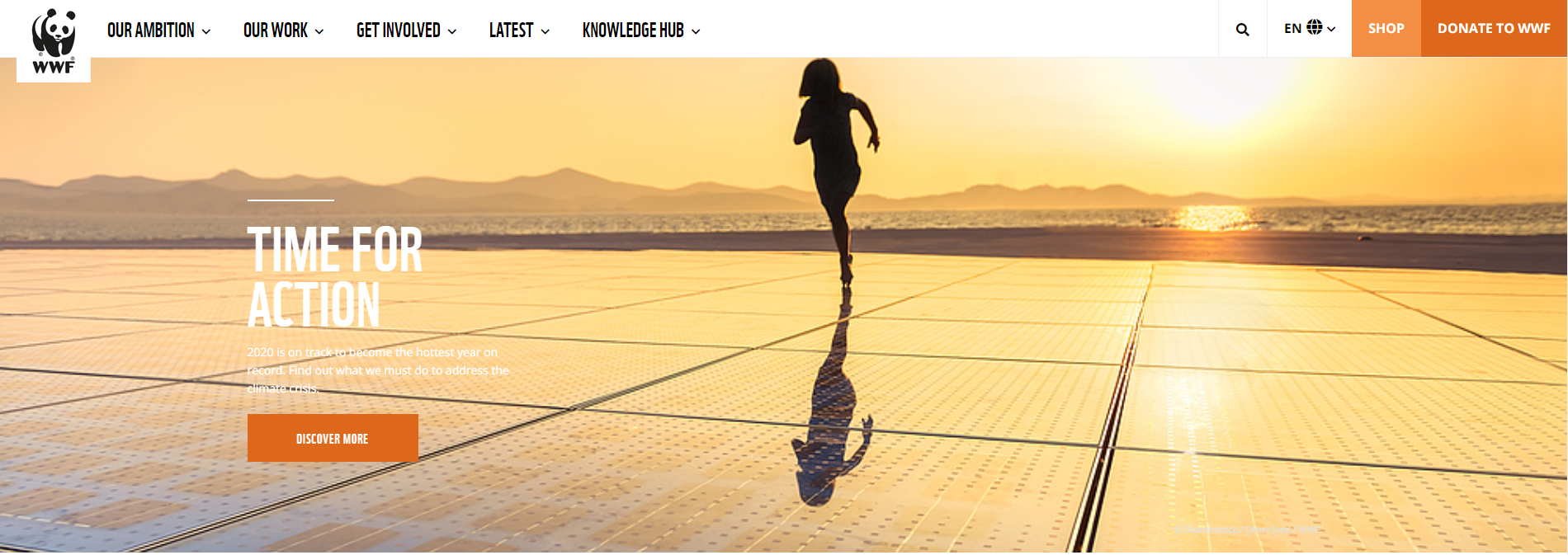
Take a look at the following homepage by a leading brand:
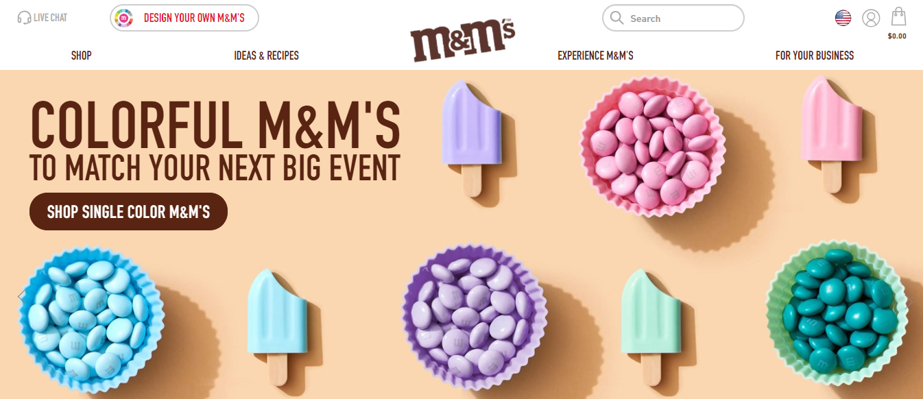
Notice how the homepage is designed meticulously and immediately draws visitors in. The visuals are clean, modern, compelling, and creative.
Depending on your industry and brand identity, you may use a more vibrant (or muted) color palette.
You can also experiment with different layouts and graphics to fit your brand personality. While these variations are acceptable—and recommended, in many cases—the overall web design should be unmistakably attractive and engaging.
We suggest consulting web design and development experts to give your website a much-needed boost in aesthetic appeal.
It’s no surprise that a whopping 73% of businesses invest in web design and development services to stand out from the cut-throat competition!
Ultimately, giving your website a makeover will go a long way in improving the bounce rate and boosting conversions. This is one of the best tips to improve bounce rate.
Your site visitors have no time nor patience for delays. If they don’t get what they want within the first 5 seconds of getting to your site, they’re going to move on to the next website (which is most probably going to be your competitor).
One great example is GAP. Within 3 seconds of viewing the website, customers have access to the line of products, sale items, different brands, and a search bar option for additional information.
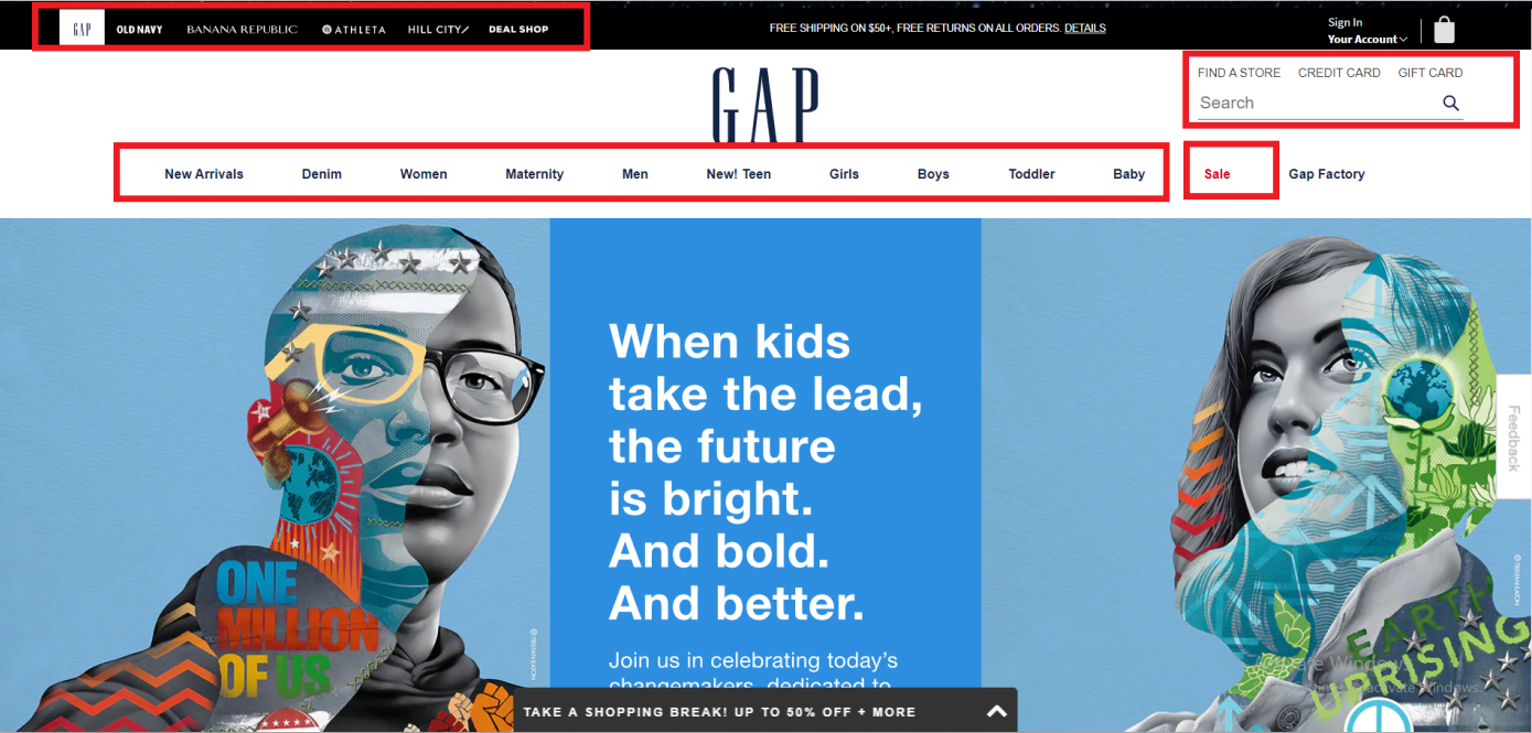
So how do you lower your website’s bounce rate? Your website needs to be built for effortless navigation:
- Make sure your website has a clean look—less is more.
- Highlight the most important pages in the navigation bar
- Anticipate your users’ behaviors. Identify hotspots and allow them to find things they’re most likely searching for.
3. Add More CTAs to the Homepage and Landing Pages
Long phone calls are generally considered big moneymakers in the fast food industry.
The longer a customer stays on call, the more extensive their order, right?
In most cases, yes. However, you’ll often stumble upon the odd customer who spends a lot of time asking for the specials but ends up ordering nothing.
If you don’t incentivize customers to place an order, you’ll gain nothing from a longer interaction.
The same rule applies to web browsing. If web users actively browse your website but don’t end up taking a desired action, you’re back to square one.
This is where calls-to-action (CTAs) work their magic.
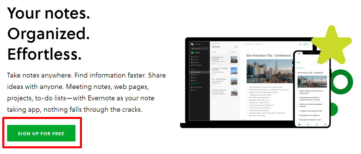
A CTA is a short phrase that compels visitors to perform an action, i.e., visit your product/service pages, sign up for your newsletter, follow your social media pages, browse through discounted items, etc. It’s a whip-smart way to keep your target audience on your website and prompt action.
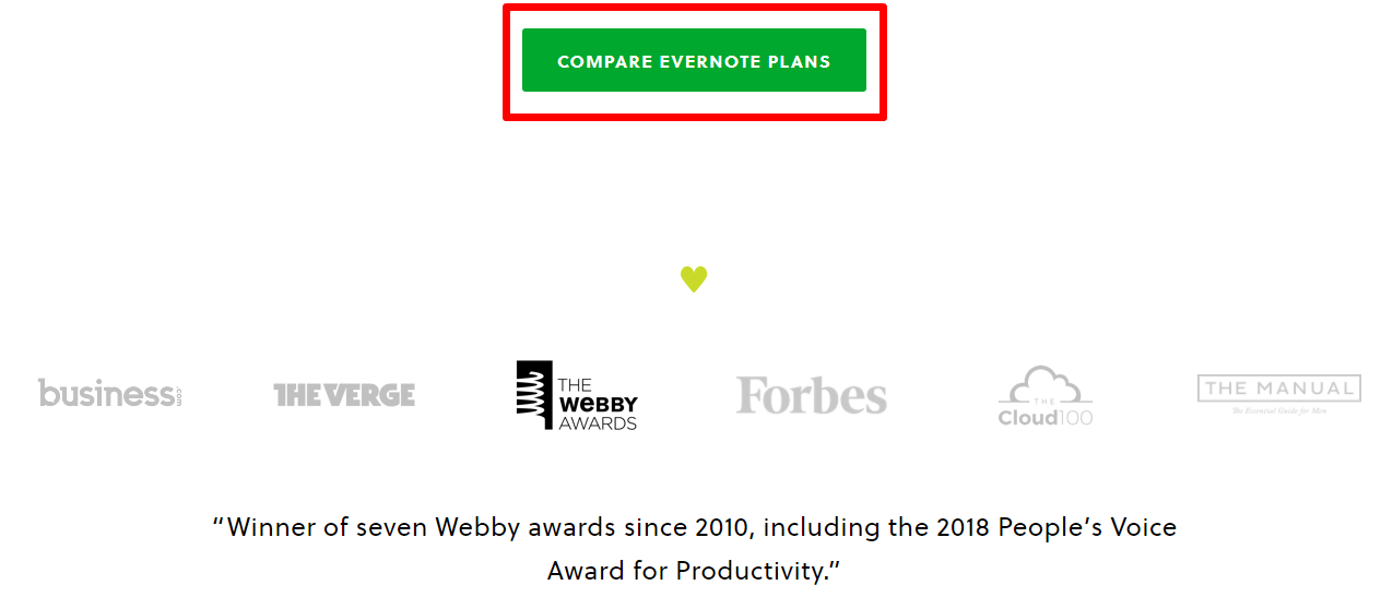
Evernote’s attention-grabbing and perfectly placed CTAs are also a master class in effective bounce rate reduction.
4. Improve Your Website’s Speed to Lower Bounce Rate
According to Think With Google:
- 53% of mobile web users exit webpages that take longer than three seconds to load
- As a website’s load time increases from 1 second to 7 seconds, the bounce rate increases by 113%
- A 1-second delay in load times can reduce conversions by up to 20%
Your website’s speed plays a big role in reducing bounce rate.
The longer you make visitors wait, the less likely they are to stick around. If your website glitches during the waiting process, your conversions will take a bigger hit.
So how do you increase your site’s speed and ultimately loweryour bounce rate?
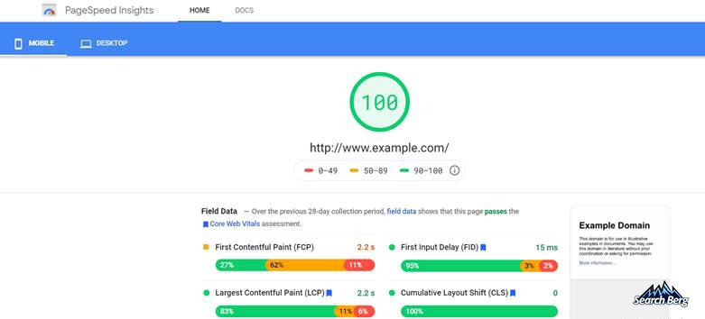
Use Google PageSpeed Insights to determine where your website stands. If things aren’t looking so good, take immediate measures to increase page speed and reduce customer attrition, i.e. the loss of customers.
Here are some strategies to improve your website’s speed:
- Use a CDN (Content Delivery Network)
- Optimize your images
- Reduce HTTP requests
- Add asynchronous pages
- Enable browser caching
- Minify and combine HTML, JavaScript, and CSS files
As your site speed increases, you’ll manage to significantly your website’s bounce rate.
5. Make Sure Your Content Is “Readable”

Take a quick look at your content—your web pages, blogs, articles, guest posts.
Are they properly formatted? Or is the content presented in a bulk that’s reminiscent of a standard Terms and Conditions file?
No matter how value-added and engaging your content may be, improper formatting can instantly turn it into an eyesore.
If your content isn’t adequately paragraphed, italicized, emboldened, and underlined where necessary, you’ll prompt yawns instead of sales. Before you know it, the yawns will turn into swift clicks on the “close” button.
Fortunately, closing this Pandora’s box is easier than you may think:
- Revisit old content.
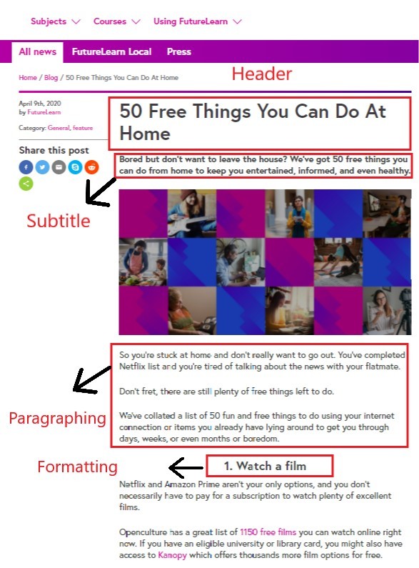
- Break it into short paragraphs to increase readability.
- Use bullet points to highlight important points (see what we just did there?)
- Introduce new headings to the file to add more structure and enhance flow.
Here is a great blog formatted to perfection:
6. Use High-Quality Images and Videos to Make a Stellar Impression
Does your website feature pixelated images?
Perhaps your visual content isn’t as strong as your competitors?
These factors play a big role in determining whether visitors stick around or get going.
If you haven’t incorporated plentiful high-quality images and videos into your web design, you may want to make some quick adjustments.
According to Neil Patel, visitors who engage with video content stay on the site twice as long and interact with twice as many webpages (as opposed to those who don’t).
Unlike text, images and videos are more eye-catching, engaging, and stimulating. When used in tandem, these forms of content yield powerful results, including greater audience engagement and improved conversions.
While you may use stock images for your homepage, avoid relying on them for the bulk of your website.
Capture high-quality images and videos of your products/services and get some impressive behind-the-scenes footage.
Feel free to let your creative juices flow! Thinking outside the box will help your content stand out from the crowd and intrigue visitors in the best way possible. We do, however, recommend running your ideas by your marketing team to ensure they align with your brand identity.This is inarguably one of the best tips to reduce website bounce rate.
7. Steer Clear of Popups

Popups can be extremely distracting and annoying. Some marketers feel they disrupt a positive user experience; others feel it could actually increase your bounce rate.
There are several brands that take it a step further by pretty much bullying their users into signing up with them. Not a great strategy if you want to build a relationship on trust and credibility. It’s too aggressive, and your site visitors may hate it.
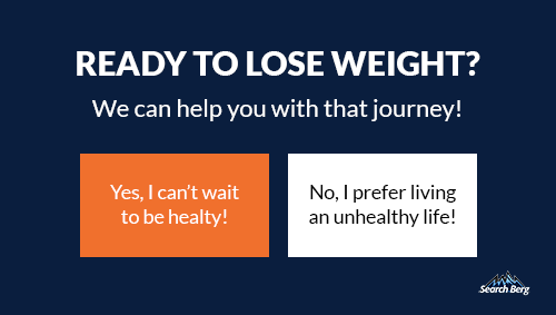
On the other hand, we can’t completely deny its effectiveness. If you do want to go down this road, consider making them as un-disruptive as possible.
Alternatively, you could also opt for a powerful CTA button or banner instead. This way, you’ll successfully prompt action without forcing it on visitors.
A high bounce rate can lower your sales in the long run. We can help turn things around!
8. Create Purposeful Content
Struggling to figure out how to lower bounce rate? It’s time to turn to content for help.
In many cases, brands hear the phrase “content is king” and optimistically jump on the bandwagon without researching. This is one of the biggest marketing faux pas that could end up taking a toll on your bounce rate.
Creating hasty content without researching trends, relevance, and customer interest can ultimately leave you with dwindling audience engagement and retention.
Instead, develop a laser-sharp focus on creating purposeful content that your audience actually wants to read/watch.
If your blog page features miscellaneous blogs that fall outside the bounds of what customers are interested in, you’ll end up losing visitors. This is more common among businesses that prioritize content quantity over content quality.
Turn things around by retouching your content marketing strategy and making extensive research a priority.
Use Google Trends to keep up with industry and region-specific audience interests and create content accordingly. Ultimately, posting relevant content will keep your target audience on your site longer and maximize conversions in the long run.
Etsy’s audience-specific blogs are paradigmatic of content that revolves around audience interest, demand, and preferences!
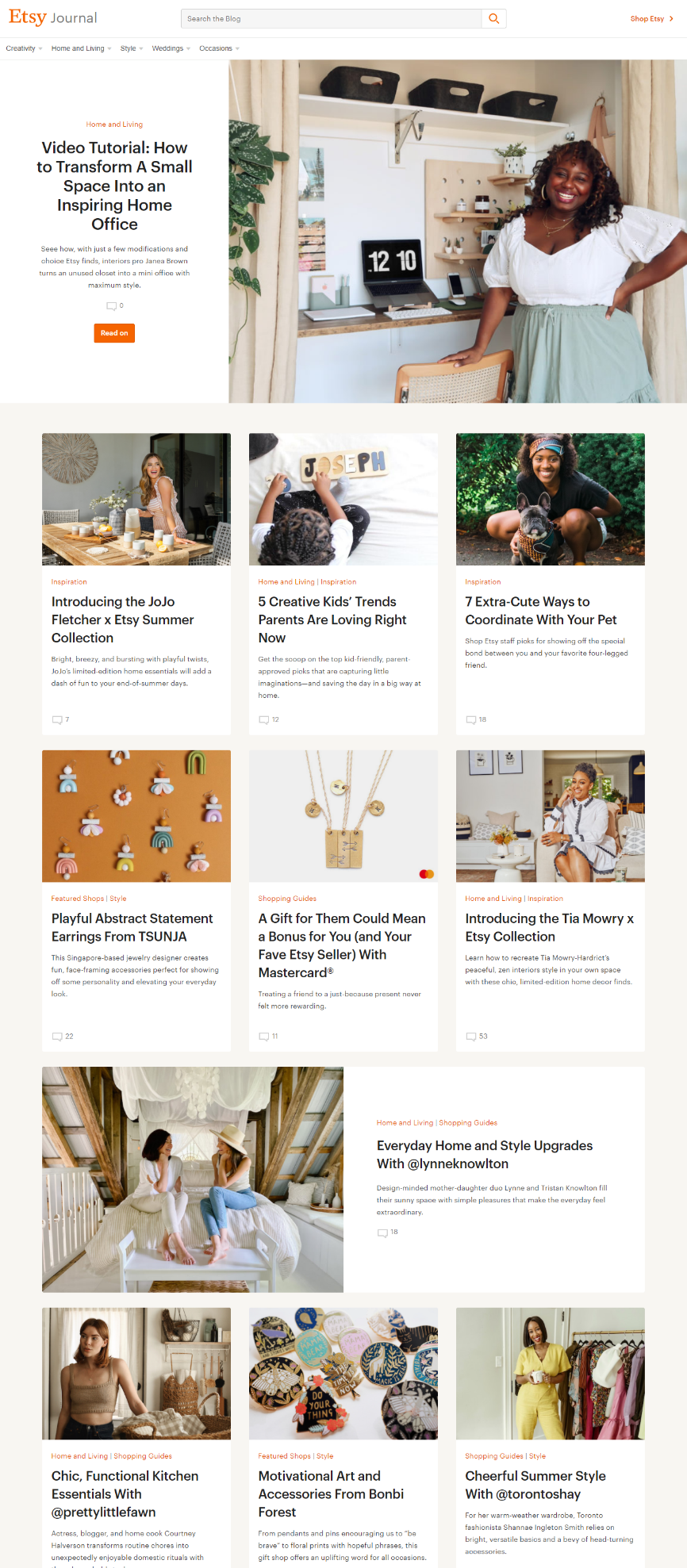
Narrow down your demographic and tailor your upcoming content plans accordingly. This simple yet effective switch will reduce your website’s bounce rate and increase the visitor-to-lead conversion rate. It’s one of the best things you can do to improve your bounce rate!
9. Prioritize User-Friendliness and Mobile-Friendliness
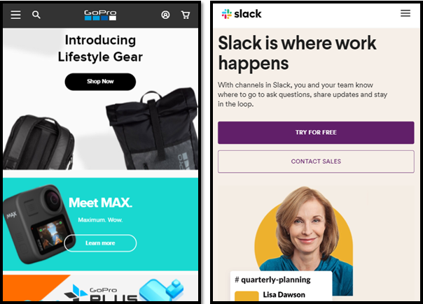
When it comes to web design, user-friendliness and mobile-friendliness are your biggest allies.
Why?
An astounding 62% of people are less likely to invest in a brand’s products/services if they have a negative experience on mobile.
And while the need for mobile-friendliness may not have been as relevant in the 2010s, it’s imperative in the 2020s.
It should come as no surprise that 52% of all web traffic is generated from mobile phones. As mobile accessibility reaches new heights, targeting customers accordingly has become non-negotiable.
If you haven’t optimized your website for mobile yet, you may want to give it another thought!
Ensuring your website operates seamlessly on all digital tools—especially smartphones—is a great way to keep visitors from clicking off your site.
We also recommend ensuring user-friendliness across the board. Improve accessibility and navigation to ensure visitors have a seamless browsing experience.
The last thing you want is to lose visitors because your navigation panel was non-clickable or too complex. These easily fixable blunders will end up saving you a ton of time, energy, money, and customers.
10.Targeted Keywords
Most often, websites are just focused on shelling out content without taking the time to a) understand who they’re targeting; b) building credibility. The result is sites with high bounce rates.
Don’t underestimate the power of targeted, high value keywords. They improve the quality of traffic (you get people who are actually looking to buy your products directed to your website). You enhance engagement,build credibility, and reduce your website’s bounce rate.
So what are targeted, high value keywords? And how do you determine a comprehensive list?
One tool you can use is Google Keyword Planner.
Insert your keyword + a qualifier and hit “Get Ideas”. It’s going to look something like this:
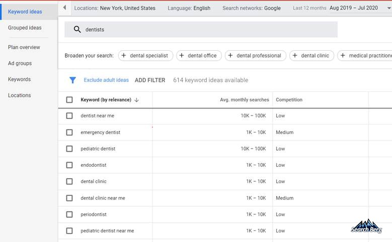
This can get a bit tricky, though; you have to be careful about not stuffing too many keywords—Google could penalize your website. You’ll also have to focus on LSI (Latent Semantic Indexing) keywords. These are conceptually-related words that search engines use.
What is a Good Bounce Rate? The Good, The Bad, and The Ugly
There’s no clear directive here. The general rule of thumb is that:
80%+ is Very Bad
70–79% is Poor
50–69% is Average
30–49% is Excellent
Note: It’s unlikely for a bounce rate to be lower than 20%, so you may want to triple-check your analytics code or add-ons.
Final Word
In this blog, we’ve discussed several content and web design tips to improve your bounce rate. If you’re losing valuable visitors because of high bounce rate, our team can give you the boost you deserve.
Keep in mind; you need a complete strategy. Let’s say you hammer down on one of these factors and you manage to get your bounce rate down by 20%. That’s a great win. But it may not be a permanent one. You run the risk of getting your bounce rate up high again.
At Search Berg, we understand how to improve website bounce rate, and offer expert content marketing, SEO and web design and development services to accomplish just that! Our web specialists use state-of-the-art tools, cutting-edge software, and extensive expertise to develop engaging websites that run seamlessly across all platforms.
Whether you’re looking for ways to reduce your website’s bounce rate or interested in reducing customer attrition, we’ll create a customized strategy accordingly.
We’re ready when you are! Call 855-444-4777 and let’s talk! Want more tips to improve bounce rate? Stay tuned for more web development content! We release new blogs every week to help you master the art of SEO.


