How to Make the Best Landing Page for Amazon Products
Your Amazon landing page is the first impression you make on web users. This is your first opportunity to wow people and give them a taste of what you have to offer.
If they like what they see, they’ll move down your sales funnel and make a purchase. If they’re put off by the design, structure, content, or development of your page, they’ll head towards the nearest exit. As a seller, you are responsible for launching a kickass Amazon landing page that puts more revenue in your pocket and prompts consistent e-commerce growth.
In this blog, we’ll help you build a power-packed landing page for Amazon products. We’ll start with a blank Amazon product page template and discuss the right way to fill it up for maximum reach, engagement, and sales. We’ll also discuss the importance of adding video to Amazon product pages.
Let’s begin!
Wait a Second, What is an Amazon Landing Page?
Let’s cover the basics real quick. An Amazon landing page is a customized page that features your products, the latest offers, coupons, images, videos, timer widgets, and other elements. Since the landing page is completely customizable, you can add pretty much anything to it to attract more online shoppers and turn visits into sales.
What makes the Amazon landing page different from a regular listing/page? The ability to receive rich insights.
The landing page gives you the unique opportunity to collect hyper-specific customer data. Monitor, track, and evaluate customer behavior to strengthen your online store and grow your audience base.
Amazon landing pages are designed for seamless tracking and conversions. Once you get things right, you’re in for spectacular sales and nuanced insights that help you fine-tune your Amazon marketing and advertising efforts.
The landing page also helps you collect email addresses and other essential information from your audience. Tit for tat; they benefit from promotion while you walk away with audience profiles that can be used for marketing and advertising purposes.
While the landing page makes things easier for your audience, it also helps you maximize conversions and stabilize your core.
The Recipe for a Successful Amazon Landing Page
1. Modernize Your Page
In 2023, we’re still seeing a lot of old-school Amazon landing pages with outdated fonts, cheesy color palettes, and poor formatting. If your landing page isn’t modern, clean, minimalist, and aesthetically appealing, your audience will bounce off the page before you even know it.
If you want people to stick around and make a sale, modernize your Amazon landing page. Start with a blank template. You can choose between thousands of templates with unique store layouts.
As you shop around, put your personal preference aside and keep your target audience in mind. Select a template that resonates with your audience, even if the design isn’t exactly up your alley.
Let’s consider an example. Known for its collection of drinkware, cookware, barware, and food storage products, Stanley gives us a clean, simple, and fuss-free landing page. Since their audience primarily comprises adults, the graphics, content, and layout are sleek and professional.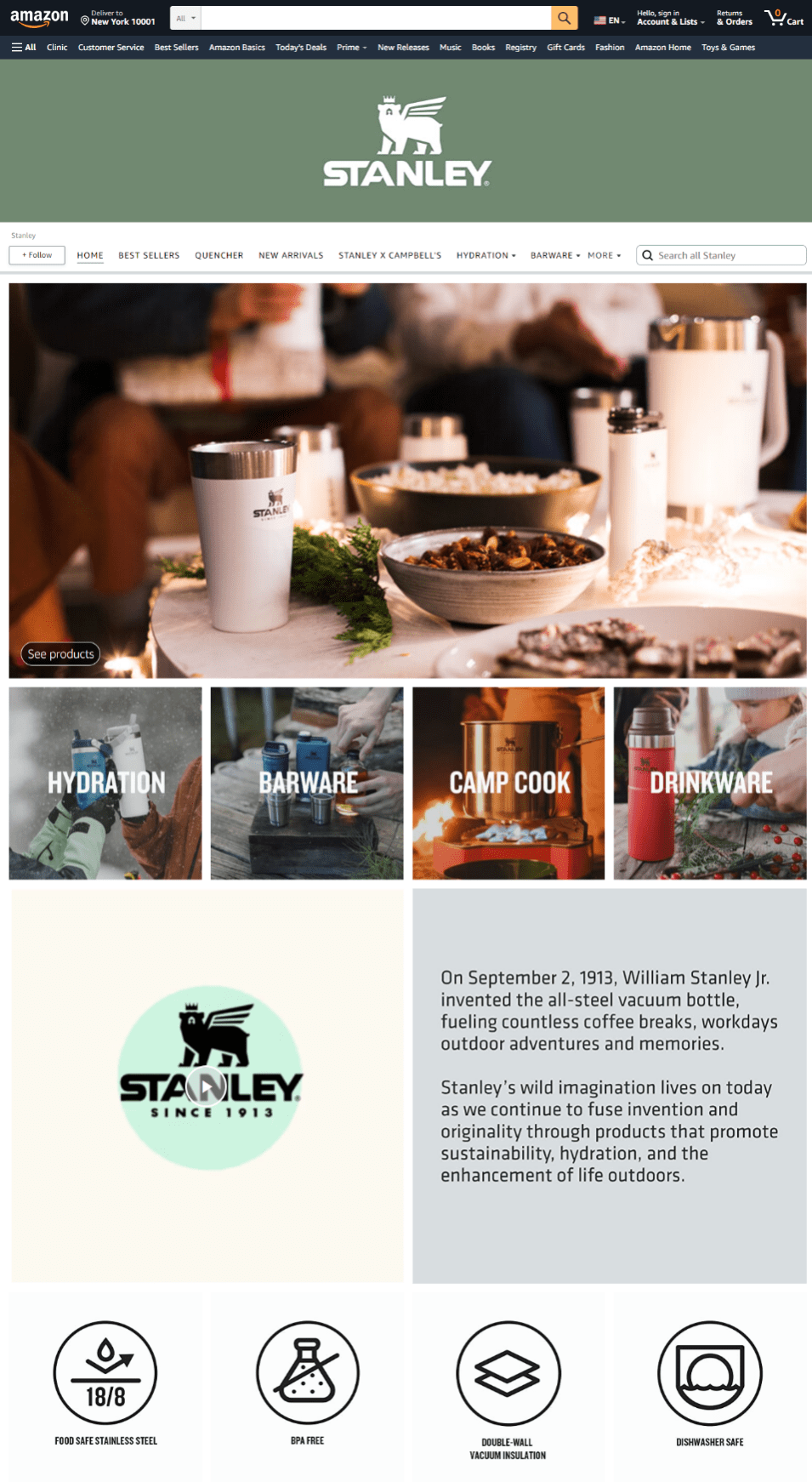
M&M’s, on the other hand, has a very different target audience. Since the brand appeals to a younger audience, its landing pages are more colorful, albeit still modern and clean.
Their Valentine’s Day landing page isn’t just another landing page; it has been carefully customized for couples who are scouring the web for Valentine’s Day presents. From the color palette to the content to the product lineup, everything is in line with what their audience wants to see.
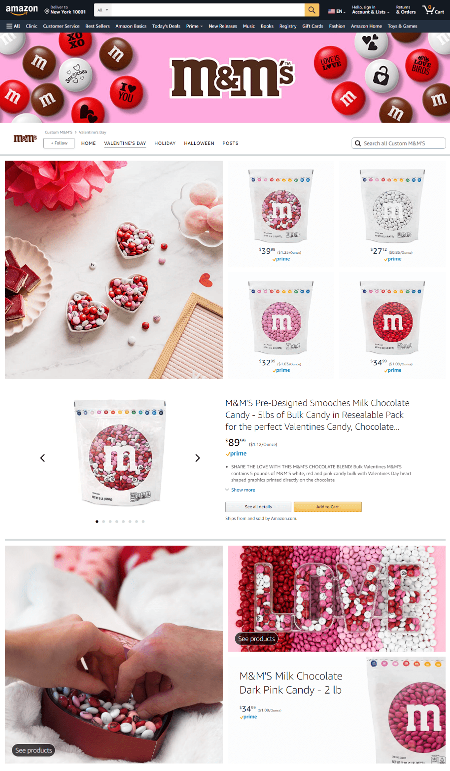
They have still managed to retain balance. The font is classic, not over-the-top cheesy. The colors are appealing, not visually overwhelming. And the formatting is easy on the eyes, not difficult to follow.
What would be a bad example of a holiday-themed landing page? This:
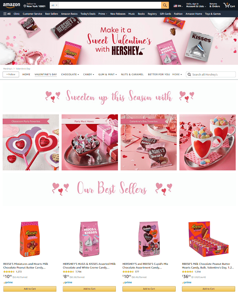
The font is unappealing, the formatting doesn’t make the products stand out, and the copy lacks creativity.
Visual cohesiveness goes a long way in compelling people to explore products and make a purchase. When you use the right template, font, colors, and graphics, you’ll make a winning impression on your audience.
Shortlist at least 5–10 templates based on your industry and audience. You don’t have to select one template; mix and match different elements to create your own customization.
The goal is to launch a landing page that instantly makes your audience go “wow”, not “yikes”. When you do your research, A/B test different page elements, and launch a visually compelling page; you’ll get the reaction you want from your audience.
2. Use Unique, Catchy & Optimized Content
Your landing page should be equipped with quality content that prompts a sale. In 2023, online shoppers are looking for creativity, uniqueness, and originality. Your content shouldn’t be boring or predictable. Instead, it should compel your audience to go through with a purchase.
Let’s look at an example.
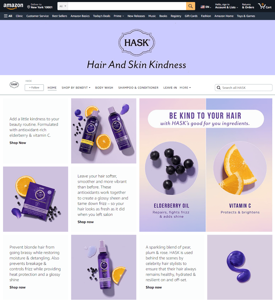
HASK’s landing page features intentional, care-driven, and informative content. People are reminded to care for their body, skin, and hair. At the same time, the seller provides adequate knowledge about the product formulation, purpose, and benefits.
The graphics are beautiful, but the content ultimately steals the show. Self-care brands must infuse a sense of kindness, care, and compassion into their products. Their copy should reflect this passion, and HASK does exactly that.
The unique and creative touch makes the content so much more appealing. Sentences like “Add a little kindness to your beauty routine” and “Be kind to your hair” compel people to take a break, slow down, and prioritize self-care. When content is written with the audience and industry in mind, you’ll manage to convert more people.
It doesn’t stop here. In addition to making your content audience- and industry-centric, optimize it like a seasoned pro. Use high-ranking keywords and write powerful CTAs to ensure that your landing page ranks high on SERPs and bags maximum conversions.
The Manage Your Experiments tool is a brilliant little helper. Sellers get a chance to A/B test (compare different versions of) content to understand what performs better. As you juxtapose product titles, bullet points, and descriptions, you’ll understand which version reels in more conversions. This is a great way to understand the type of content that resonates with your audience and, of course, maximize sales.
3. Raise the Visualization Bar with Images
We touched upon the importance of visuals before. In this section, we’ll get a bit more specific. Yes, choosing the right template is extremely important, but it’s not enough. If you fail to equip your landing page with exciting visuals, you’ll struggle to convert your audience.
In 2023, people want to see more visuals and read less text. Your Amazon landing page should be a visual feast through and through. Choose high-quality product images, design a customized banner image, add a video to the page, and optimize all graphics.
Avoid using stock photos. Instead, generate new visual content that resonates with your audience. Original, unique, and eye-catching content will help you launch a livelier landing page that sparks joy.
Make sure you optimize visual content with filename and alt text. In 2023, the visualization bar has been set a lot, lot higher. Sellers aren’t just cleaning up their visual act—they’re also going the extra mile to generate visual memorability.
If you want to check this box off the list, weave your brand’s distinct colors into your landing page. If you have a unique color palette, it should become apparent at first glance. Let’s consider an example. Tommy Hilfiger has a distinct red, white, and blue color scheme. As you explore their Amazon landing pages, these three colors will stand out.
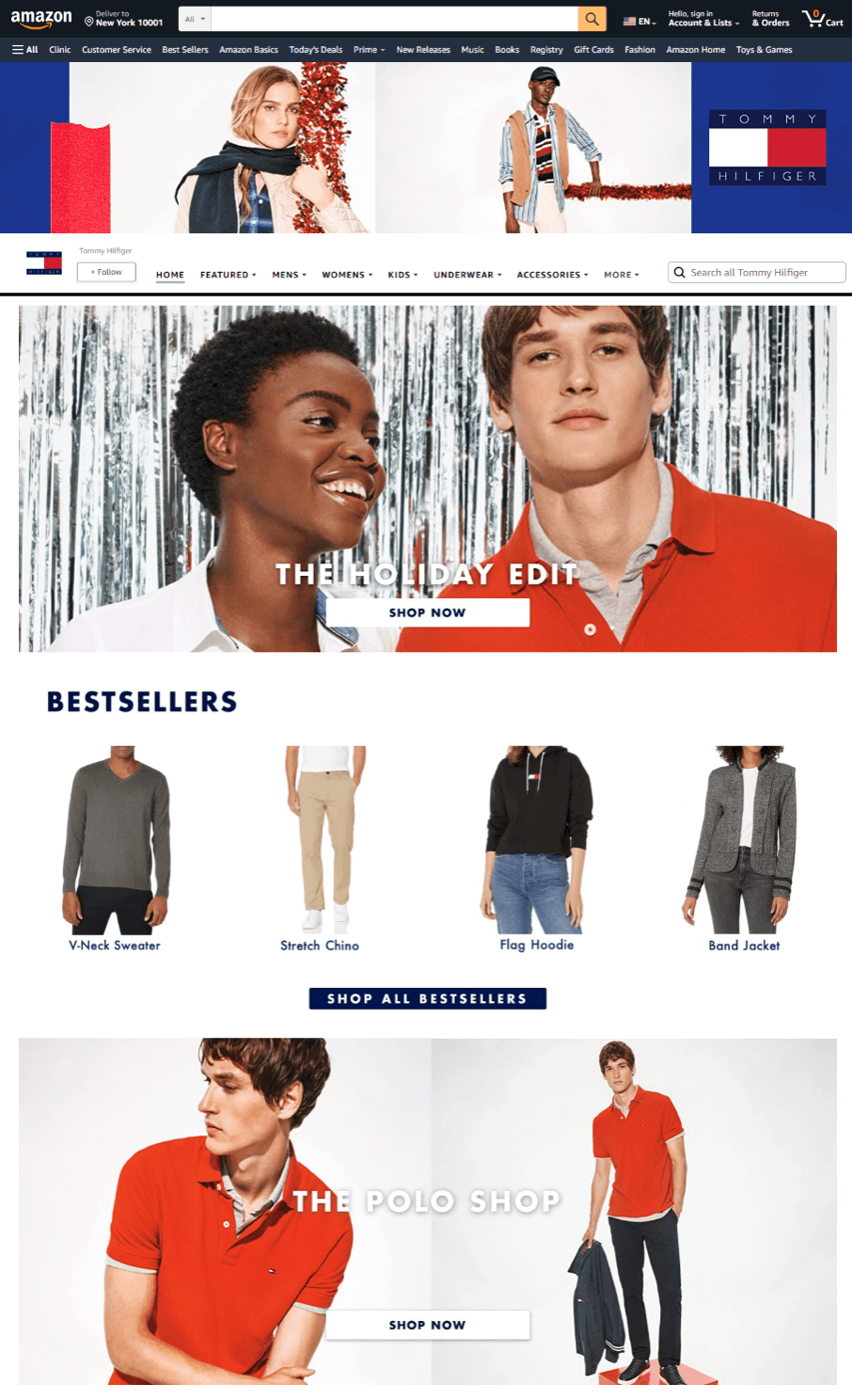
This approach will help you strengthen your brand identity and increase brand recall. Since your landing page will not include a random mix of colors, you’ll also manage to reduce visual strain.
Make sure your landing page is replete with visual content. Sellers often make the mistake of using more text than images. While this approach is suitable for written content (e.g., a blog), it’s a bad call for landing pages. Visual content helps online shoppers understand what a product looks like. When your landing page is supplemented with images, you’ll enjoy a higher conversion rate.
Recommended Read: 11 Ways to Triple Your B2B Ecommerce Conversions
4. Steal the Show with Video Content
Let’s circle back to video content. In 2023, the power of video cannot be ignored. Image-based content stimulates the visual sense, but video content also stimulates the auditory sense. Needless to say, its performance is unmatched.
When people can see what a product looks like in action, they make speedier purchases. Adding video to Amazon product pages is an excellent way to shorten the sales funnel. You’ll manage to educate your audience about your product’s features, design, function, and benefits.
However, it’s important to note that video content can easily go wrong when sellers take shortcuts. Instead of grabbing a camera and casually filming your products, consider hiring a professional team with the aesthetic eye, experience, expertise, skills, and equipment needed to achieve a stellar outcome.
Before you launch your project, revisit Amazon’s video requirements. Video content must have a 16:9 aspect ratio and a minimum resolution of 1280 x 720 pixels. Make sure the format is MP4, 3GP, MOV, AAC, FLV, AVI, or MPEG-2. While there are no restrictions regarding the video duration, it shouldn’t be longer than two minutes.
You can choose between four types of video content:
- Product Highlights Video: A short clip that captures the product’s key features and helps customers understand how they can benefit from it. Product highlights videos provide a clear view of the product with ample close-up shots from different angles. Customers should be able to clearly see what the product looks like on its own and once it’s in use.
- Customer Experience Video: A short clip of a customer using the product in real life. This can also be a testimonial video that features clips of the product in use.
- Explainer Video: A short clip that educates customers about a product. An explainer video can be a little longer, especially if a product is more complex in nature, e.g., an appliance. The video answers FAQs about the product and helps customers understand how it can solve their problems.
- Comparison Video:A comparison video shows customers how a product stacks up against other options on the market. The goal is to convince people that your product is the best option available.
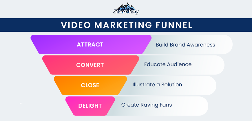
Optimize video content with a keyword-optimized title, add a relevant thumbnail (keep quality and visual appeal in mind), and A/B test it over time to further enhance performance. Keep the video marketing funnel in mind to achieve the intended outcome: maximum conversions.
5. Add Exciting Offers
People love a good offer. If your Amazon landing page offers an exciting sale, discount, coupon code, or any other offer, you’ll increase your chances of earning a conversion. Make sure you utilize Amazon’s incredible features, especially the coupon expiration timer that lets customers know how much stock remains.
Scarcity features catch the eye and create a sense of urgency. When customers find out that only two pieces are left at this price, or the sale lasts only two more hours, they’re more likely to purchase.
This is a great way to inject the fear of missing out (FOMO) into people’s minds. When they realize they have to act fast to avail an offer, you’ll reap the benefits of a sweeter conversion rate. We also recommend using the countdown timer to display the time left until an exclusive offer expires. The timer shouldn’t display more than 12 hours.
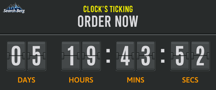
If you’re offering exclusive coupon codes, set up a counter that displays the number of unique coupons left. This is also an excellent way to create urgency and compel people to avail the code while they can.

Put your customer hat on and get creative! When you launch exciting offers with a creative twist, you’ll build a wide audience that doesn’t just visit your store but actually makes a purchase.
6. Add Social Proof
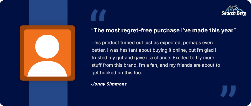
Social proof can help you turn a double-minded prospective buyer into a happy customer. Online shoppers have their guard up, especially if they’ve been scammed before. Products don’t always turn out to be what they look like, which is why reviews play a pivotal role. Collect social proof and proudly display it on your landing page to turn shopping doubt into confidence.
Prepare for Landing!
The flight’s on time; passengers are on the way! If you’re not ready for landing yet, start gearing up! In this blog, we walked you through the right way to build a landing page for Amazon products. Now that you have a good understanding of how to launch a power-packed landing page, it’s time to get the wheels moving.
At Search Berg, we design, develop, optimize, and manage Amazon stores for clients across the globe. Explore our Amazon listing optimization services to understand how we can help you scale your business, drive more revenue, and maximize ROI.
Besides listing optimization, our Amazon specialists also develop an omni-channel approach to help you enjoy spectacular results. From creating a custom Amazon product page template to adding video to Amazon product pages for greater conversion potential, we check every box off the list.
Let’s prepare for landing, we’re ready when you are!


