How Web Design Services Are Redefining Online Success in 2023
In 2023, the rule of “form follows function” has been updated to “stunning form with spectacular function.” Websites aren’t just digital placeholders or simple signboards anymore. In the visual-centric era, if your homepage lacks aesthetic appeal, you’ll hear digital crickets instead of conversions.
As humans, we’re hard-wired to enjoy visuals that tantalize our senses and spark our imagination. If you’re a small to medium-sized business looking to leapfrog your competitors and soar into the stratosphere of dazzling SEO performance in 2023, you may want to cast a strategic eye toward web design services.
The digital gold rush is over; the new focus is on harnessing the power of functionality and aesthetics to achieve the perfect balance between performance and design.
In this blog, we’ll help you get there. How are web design services redefining online success in 2023? How can responsive web design help improve your SEO rankings, user engagement, and conversion rates? And which cut-throat web design strategies can propel you to the top? We’re diving right in!
1.The Importance of Web Design in 2023
Just as the appeal of a brick-and-mortar store’s aesthetics can lure in a window shopper, web design is the magnet that draws digital footfall to your virtual storefront.
In the ever-evolving digital landscape of 2023, the importance of web design has skyrocketed. According to a compilation of cut-throat statistics from Forbes Advisor:
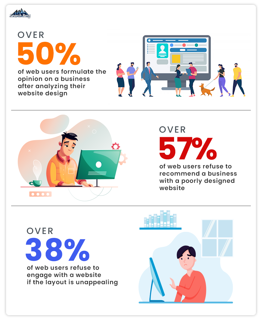
See what we mean?
If your website is an eyesore, web users will head towards the nearest exit. And if your website is a visual feast, well, you’re in for a treat (so long as you check other critical boxes off the list as well).
To understand the importance of web design, let’s visualize two shoe stores.
Store A is an amalgamation of disorganized product images, illegible fonts, and conflicting color schemes. The shoes themselves are fantastic, no qualms about it, but the cluttered interface and lack of intuitive navigation turn browsing into an overwhelming task. It’s like being in a shoe store with all the shoes thrown in heaps; finding the perfect pair feels like a Herculean task. Shudder.
Now, let’s look at Store B. Its website greets you with high-resolution images of trendy shoes stylishly displayed against a clean, visually appealing, and modern backdrop. The site’s layout is intuitive; web users can easily filter shoes by size, color, style, and price. It feels like walking into an immaculately organized boutique.
If you were a customer, which store would you prefer? The answer is crystal-clear: Store B.
This analogy illustrates the undeniable importance of web design. A visually appealing, well-designed website is your golden ticket to building trust with potential customers.
As Google’s algorithm continues to favor user experience (UX), the impact of web design on SEO is now more significant than ever.
Beyond UX, web design serves as the foundation of your brand’s online identity. In the digital world, where face-to-face interactions are limited, your web design can serve as the ‘first handshake.’
It communicates your brand’s personality, values, and promise to potential customers. It’s a language that tells your brand’s story, creates emotional connections, and sets you apart in a crowded online marketplace.
Web design can also significantly influence website performance and functionality. Responsive web design, for instance, has become non-negotiable in 2023, with over 50% of web traffic now coming from mobile devices. Websites that aren’t optimized for different screen sizes risk losing a substantial amount of traffic and, consequently, potential sales.
Small to medium-sized businesses are in a unique position where they can use website design services to compete with industry giants. The introduction of advanced technologies like AI and AR into web design further opens up exciting opportunities for businesses to engage with their target audience.
2. How Can Web Design Help Boost SEO and User Engagement?
The digital sea is filled with thousands of businesses floating around. In this vast expanse, how can your business stand out? And how can you make sure it doesn’t sink into oblivion?
The answer lies in understanding the symbiotic relationship between web design, SEO, and user engagement.
2.1. Make Friends with Search Engines
Establishing a cordial relationship with search engines, particularly Google, is critical. They serve as the bridge between your website and potential users. Your website must be designed in a way that appeals to these digital matchmakers.
Here’s how good web design can aid in this process:
2.1.1. Speed Matters
Google is a firm believer in the adage, “time is money”. Websites that load faster provide a better user experience and rank higher on SERPs.
A well-designed website minimizes the use of heavy, resource-intensive elements, uses efficient code, and leverages techniques like lazy loading for images. These design decisions can help reduce load time. The outcome? Both users and search engines will applaud your efforts.
2.1.2. Prioritizing User Experience
In 2021, Google announced the inclusion of Core Web Vitals in its ranking algorithm. These metrics measure aspects like loading performance, interactivity, and visual stability, all of which are essential for a positive user experience.
Web design plays a significant role in optimizing these metrics. For instance, reducing the amount of layout shift on your pages can help improve your Cumulative Layout Shift (CLS) score, one of the Core Web Vitals.
2.1.3. Embrace Mobile-First Design
The paradigm shift towards mobile internet usage has led search engines to prioritize mobile-friendly websites. Responsive web design, which ensures your website adapts to fit any screen size, is now a necessity rather than a luxury.
It means creating a website that looks good and functions optimally, whether it’s viewed on a desktop, tablet, or smartphone. This mobile-first approach is key to better search engine rankings.
2.1.4. Structure for Success
Search engines utilize bots to crawl your website and understand its content. If your site is designed with a clear, intuitive structure, these bots can index it more efficiently.
This includes having a logical hierarchy of pages, using descriptive URLs, and providing a detailed sitemap. It also extends to on-page elements like using header tags (H1, H2, etc.) correctly and incorporating keywords into your content naturally.
All these factors make it much easier for search engines to understand your site and improve your rankings.
2.2. Engage Users Like Never Before
As businesses across the globe compete for attention in the digital marketplace, user engagement has emerged as a critical metric for success. A beautifully designed, highly functional website isn’t just a nice-to-have; it’s the linchpin of a successful digital strategy.
Here’s how innovative web design is pushing the boundaries of user engagement:
2.2.1. Narrative-Driven Design
Your website is more than just a digital brochure; it’s the stage upon which your brand’s story unfolds. A well-crafted website uses design elements to draw the user into this narrative.
Each aspect is a chapter in your brand’s story: powerful imagery, compelling copy, and interactive elements. They help capture user attention and keep web users engaged until the end.
2.2.2. Simplifying User Experience (UX)
At its heart, user engagement is about delivering a positive user experience. This starts with creating a website that’s easy to navigate and interact with.
Simplified navigation, clear calls-to-action, and consistent design elements create a smooth, intuitive user journey. The less effort users have to put into using your site, the more likely they are to stay, explore, and eventually convert.
Turn to professional small business web design services to simplify UX like a seasoned pro.
2.2.3. The Magic of Microinteractions
Microinteractions are subtle design elements that react to the user’s behavior, e.g., a button that changes color when clicked or an animation that plays when a user hovers over a certain element.
While these may seem insignificant on their own, collectively, they contribute to a more interactive, satisfying user experience. Microinteractions provide immediate feedback, guide the user, and bring a sense of real-world interactivity to the digital space.
2.2.4. Personalization
One-size-fits-all is a thing of the past. In 2023, web users expect experiences tailored to their preferences. By integrating AI and machine learning into web design, businesses can offer a high degree of personalization.
This could be as simple as greeting returning visitors by name. Or it could be as sophisticated as giving personalized product recommendations based on visitors’ browsing history (we’re looking at you, Netflix!).
2.2.5. Engaging Through Accessibility
Inclusive web design ensures that everyone, including users with disabilities, can interact with your website easily. This includes using color contrasts effectively, providing alternative text for images, and making sure your site can be navigated using a keyboard.
An accessible website will broaden your audience and improve user engagement by providing a positive experience to all visitors.
3. Innovative Web Design Strategies for 2023
3.1. Adaptive AI Design
Imagine walking into a store where the salesperson knows your preferences, offers products that match your taste, and even anticipates your needs before you articulate them.
Sounds like a dream, right?
Welcome to the world of adaptive AI design!
Artificial Intelligence, in the context of custom web design, is all about creating hyper-personalized experiences for each user. Leveraging machine learning algorithms, websites can learn from a user’s behavior, preferences, and interaction patterns. This insight can then be used to adapt the website’s content, layout, and even functionality to match the user’s needs.
For example, an online clothing retailer could use AI to track a user’s browsing and purchase history. The website can then highlight products that match the user’s style, suggest outfit combinations, or even predict future trends that the user might be interested in. This level of personalization creates a unique, engaging experience that enhances user satisfaction and boosts conversion rates.
AI can also be used to optimize website performance in real-time. It can analyze user data to identify areas of the site that might be causing friction or where users tend to drop off and adjust those elements dynamically to improve user experience.
However, it’simportant to strike a balance between personalization and privacy. While users appreciate a tailored experience, they also value their privacy. If you want to use adaptive AI design responsibly, be transparent about the data you collect and how it’s used. You should also give users the ability to opt out of what they choose.
As we stride into 2023, adaptive AI design is poised to transform how businesses interact with their target audience online. The benefits of shifting from a one-size-fits-all approach to a personalized, user-centric model? A more engaging, satisfying, and successful online experience for both the user and the business.
3.2. Dark Mode Design
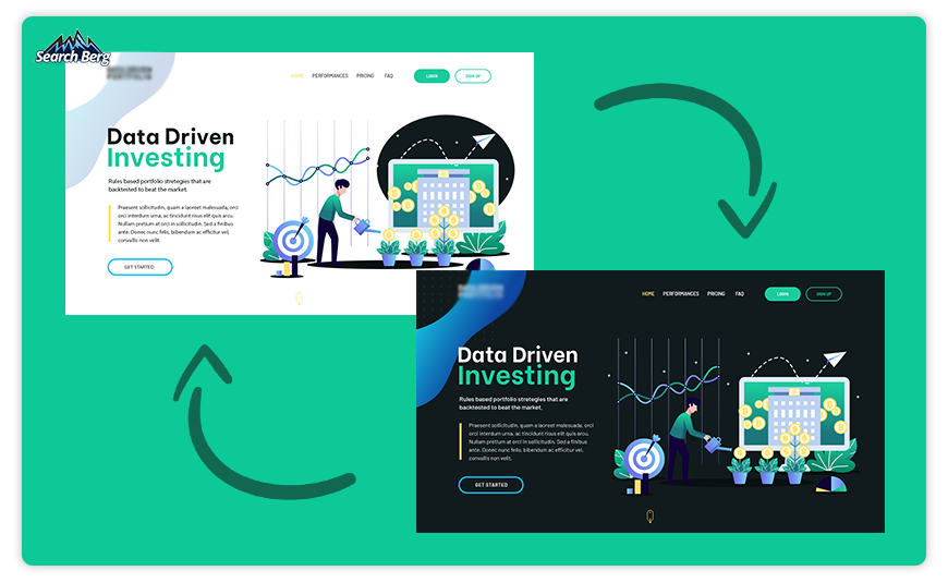
The dark side has always held a certain allure; Darth Vader, Batman, and even ninjas have an undeniable appeal. But who would’ve thought that this obsession with all things dark would seep into the web design world?
Enter dark mode design: an innovation that’s making users and designers see the web in a whole new light… or should we say, lack thereof?
Dark mode design has recently risen from the shadows to become one of the hottest trends among website designers. It’s all about swapping traditionally bright, white backgrounds for deeper, darker shades. The result? A sleek, modern aesthetic that looks cool and offers a more comfortable browsing experience.
Think of dark mode as the digital equivalent of switching off the lights in your living room and watching a movie with only the glow of the screen lighting up your surroundings. It’s immersive, it’s easy on the eyes, and it lets the content truly shine.
One of the major draws of dark mode is its potential to reduce eye strain. Many users find that darker interfaces are easier to look at for extended periods, especially in low-light environments. This can translate into longer, more comfortable browsing sessions: an obvious plus for businesses aiming to keep users engaged on their sites.
But dark modeisn’t just about creating a comfy digital reading nook. It also offers a practical benefit: power conservation. OLED and AMOLED displays, used in many smartphones and tablets, consume less power when displaying darker colors. So browsing in dark mode can actually extend a device’s battery life: a bonus for on-the-go users.
Designing for dark mode involves more than just flipping the color palette. It requires careful consideration of color contrast, text readability, and image treatment.
Subtlety is key; too many bright colors can cause glare against a dark background, while too much darkness can make details hard to discern.
Offering a toggle for users to switch between light and dark modes is a considerate design decision; it gives users complete control over their browsing experience.
In the realm of professional website design services, dark mode is the new black; its sleek aesthetic and user-friendly benefits make it a trend to watch out for in 2023!
3.3. 3D Visuals
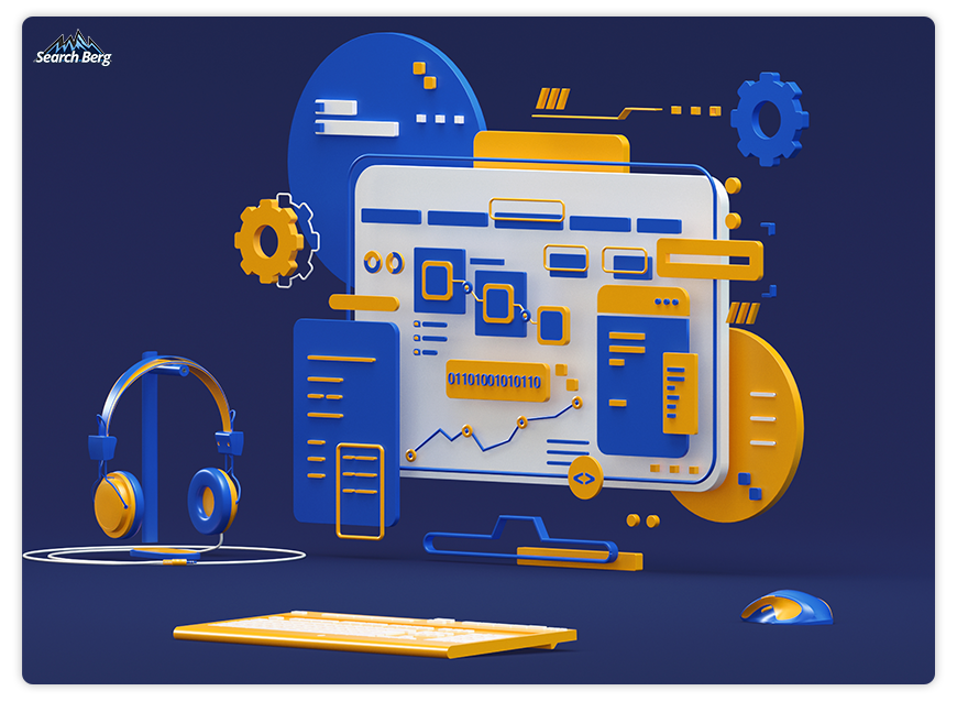
If you thought 3D was only for blockbuster films and video games, prepare to have your mind blown. 3D technology is steadily carving out its niche in the realm of web consulting and design, and it’s easy to see why.
3D visuals in web design are like that extra shot of espresso in your morning coffee; they add depth, intensity, and a whole lot of ‘wow’. They provide an immersive experience that 2D visuals just can’t match, no matter how hard they try.
Consider an online furniture store as an example. Sure, viewing a 2D image of a couch may give you a basic idea of how it looks. But being able to rotate a 3D model, zoom in on the fine leather texture, or even visualize it in your own living room through augmented reality (AR)? That’s not just shopping, that’s an experience.
With the advent of virtual reality (VR), 3D visuals are becoming more than just static images. Websites can now incorporate VR interfaces and invite users to step into a full-fledged 3D environment. Imagine taking a virtual tour of a hotel before booking your stay or exploring the features of a new car model as if you were actually sitting inside it! Holy moly.
But before you dive headfirst into the world of 3D, a word of caution: like a potent hot sauce, a little goes a long way. Overusing 3D visuals can make your website feel cluttered and slow down load times. The outcome? Frustrated web users. Master the art of using 3D to enhance your site, not overwhelm it. Once you get this balance just right, you’re in for a ride.
Creating 3D graphics also requires specific technical skills and tools. Instead of taking things into your own hands, turn to an experienced website design company that can take the reins for you.
As screen resolutions improve and internet speeds increase, we’re expecting to see more websites incorporating 3D visuals. Whether it’s a subtle 3D icon that adds depth to your homepageor a full-blown VR interface that lets users explore your products in a virtual space, 3D design is here to make the digital world more dimensional!
3.4. Augmented Reality (AR) Experiences
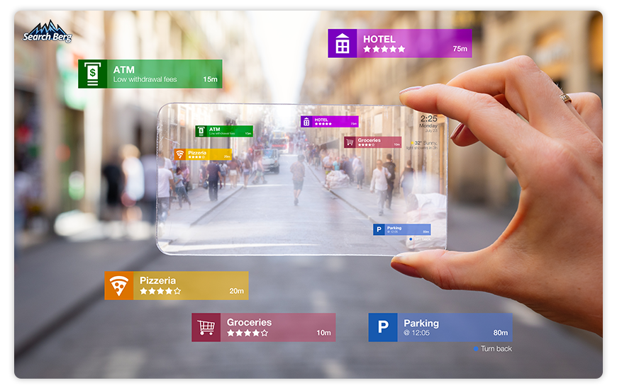
In 2023, we’re blurring the lines between the physical and digital realms more than ever. What’s leading the charge? Augmented reality (AR).
When it comes to website design, AR is that show-stopping magic trick that makes users go, “How on earth did they do that?” It’s the jetpack that launches a humdrum browsing session into an out-of-this-world experience.
AR in web design involves overlaying digital elements onto the real world, thereby creating an immersive, interactive experience. But don’t confuse it with its cousin, virtual reality (VR). While VR is like stepping into a different universe, AR is more like inviting that universe into your living room.
Consider this scenario. You’re shopping for a new coffee table online. You find a piece you like, but you’re unsure if it’ll fit your living room aesthetic. Enter AR. With a simple click, you can visualize the table right in your space, examine it from different angles, and even check if its color matches your decor.
Now, that’s a shopping experience that’s leagues ahead of squinting at 2D pictures and guessing if the coffee table will fit next to your loveseat!
While AR undeniably enhances the user experience, you might be wondering, “How does an AR experience with responsive web design help with SEO?”
The answer lies in the immersive, engaging nature of AR experiences. They keep users on your website longer. As a result, they increase dwell time: a metric that Google considers when ranking websites. AR experiences also increase user interaction. The sweet outcome? Lower bounce rates and, in turn, better SEO rankings.
AR can surprisingly aid in generating quality backlinks. Unique, interactive AR content is more likely to get shared, generate buzz around your site, and attract links from other websites. Remember, backlinks are like votes of confidence in the eyes of search engines; they help improve SEO rankings.
Recommended Read: 10 Types of Backlinks and How to Create Them
With the release of Apple Vision Pro, Apple’sfirst-generation AR-VR headset, we’re expecting to see a lot more interactive AR content. In fact, its innovative features have the potential to revolutionize interactive AR web design.
Apple Vision Pro operates using visionOS. It provides an infinite canvas and cleverly frees apps and media from the confines of traditional displays. This allows digital content to be presented side by side at any scale, creating a vast display surface around the user. This can open up new dimensions in AR web design as designers can explore infinite spatial configurations for their content.
Pretty awesome.
One of the most unique features of Apple Vision Pro is its custom micro-OLED display system. With 23 million pixels, it’s akin to having a portable 4K display in front of each eye. This feature can provide an immersive, high-resolution canvas for AR web designers to work with.
While implementing AR into your website may seem like a giant leap, the payoff can be substantial. From increasing user engagement to enhancing SEO, AR has the potential to transform your online presence.
Remember, AR isn’t just about novelty; it’s a valuable tool that brings tangible benefits to the table (and can even help you choose that table!). As we venture further into 2023, let’s not just browse the web; let’s augment it. Work with experienced professional website design services to leverage this innovative technology like a seasoned pro.
3.5. Voice User Interface (VUI)
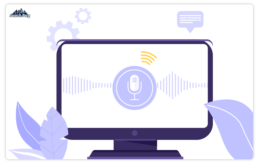
If you’ve ever found yourself saying “Hey Siri” or “Okay Google,” then you’ve already dipped your toes into the pool of voice user interface (VUI).
VUI involves designing for interactions that take place through voice, enabling users to navigate and control a website simply by speaking. It’s like having a conversation with your website, except the website does all the listening, and you get to do all the talking.
Let’s say you’re cooking and need to check a recipe online, but your hands are covered in flour. With VUI, you can just ask your device to read the recipe out loud, saving you from a sticky situation. Or consider a visually impaired user who finds it challenging to navigate a traditional website. VUI can make the web a more accessible space, enabling everyone to surf the digital wave.
Designing for VUI involves understanding how people naturally communicate and crafting voice interactions that feel smooth and intuitive. You’re not just building a website; you’re designing a conversation, a sonic experience that resonates with your audience.
But it’s not all talk when it comes to VUI; there are significant SEO benefits as well. Voice searches are usually longer and more conversational than typed queries. This means optimizing for voice search can help your website rank for long-tail keywords.
Moreover, as search engines strive to deliver precise answers for voice queries, securing the coveted position of the ‘featured snippet’ can significantly boost your website’s visibility.
The rise of voice assistants and smart speakersis also worth considering. More and more people are turning to these devices for their online searches. Launching a VUI-enabled website is a great way to ensure you’re not missing out on this growing segment of users.
However, voice design comes with its challenges. Unlike visual interfaces, where users can skim through content quickly, voice interfaces are linear and require users to listen to information sequentially. This means information architecture and content hierarchy must be carefully crafted for optimal user experience.
Turn to professional web consulting and design experts who can take care of all the legwork for you. Professional website design services are your golden ticket to making the most of VUI in 2023.
3.6. Neumorphism
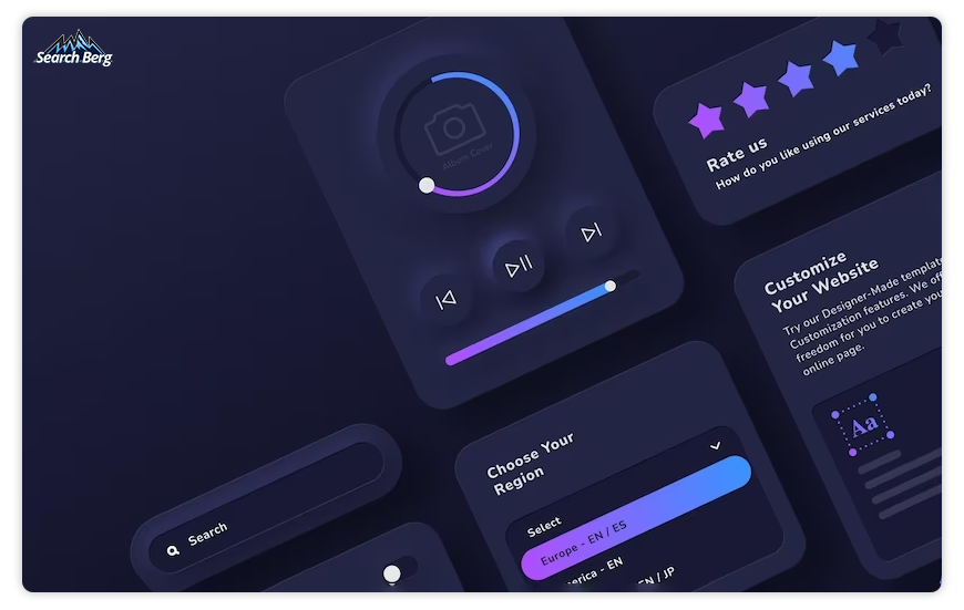
In the wide world of web design, flat design has reigned supreme for a while. In 2023, however, a new kid has appeared on the block, neumorphism, and it’s ready to bring a whole new depth to your online presence.
Neumorphism, or new skeuomorphism, is a design trend that combines elements of flat design with old-school skeuomorphic details to create an entirely fresh look and feel.
If flat design is a minimalist modern art piece, neumorphism is a beautifully detailed sculpture. It plays with light, shadow, color, and depth to create interfaces that seem almost tangible, as if they’re popping out of the screen.
Think of buttons that look so real and soft, you can almost feel the click under your finger. Or text boxes that look like they’re gently pushed into the background. It’s like your screen has suddenly developed a sense of touch, offering a tactile, engaging user experience!
Exhilarating, right?
But the beauty of neumorphism isn’t just skin-deep. It can also benefit usability by subtly guiding users’ eyes to interactive elements like call-to-action buttons and navigation bars. When used effectively, neumorphism enhances not just the look but also the feel of your website.
However, with great design power comes great responsibility. When implementing neumorphism, it’s important to ensure that the interface remains accessible. The subtle design elements characteristic of neumorphism, like soft shadows and light color gradients, may pose readability challenges for some users, particularly those with visual impairments. Designers must strike a balance between aesthetics and accessibility.
Neumorphism also calls for careful consideration of color. Since it relies heavily on light and shadow, it’s not as flexible with color schemes as flat design. The wrong color combinations can disrupt the 3D effect. Make sure you carefully select the right hues to maintain the unique aesthetic.
Ready to give this technology a go? Sign up for professional website design services. At Search Berg, we masterfully weave neumorphism into our custom web design plans to achieve spectacular results. We’re ready when you are!
3.7. Micro-Animations

In the symphony of web design, micro-animations are the subtle notes that, while not immediately noticeable, come together to create a harmonious user experience. Think of them as the delicate trills and grace notes that guide users through the melody of the website.
Micro-animations are subtle, tiny animations that provide feedback, guide tasks, or visualize the result of an action. They’re the button that appears to press down when you click it, the playful spinner that entertains you while a page loads, or the checkbox that satisfyingly ticks when a task is completed. They’re like the digital equivalent of a wink or nod: small but powerful communicators.
But don’t let their size fool you. While they might be “micro” in scale, their impact on user experience is anything but small. Micro-animations can guide users, provide instant feedback, and enhance the sense of direct manipulation. They can transform mundane tasks into engaging interactions and turn intuitive actions into rewarding experiences.
Let’s take a simple example: submitting a form on a website. Without micro-animations, you click the submit button and…nothing. You’re left wondering whether your action registered.
Now imagine the same scenario, but this time, when you click the button, it changes color. A small spinner appears, indicating that your form is being processed. Once the submission is successful, you will see a green checkmark.
This scenario feels more responsive, doesn’t it? That’s the power of micro-animations.
But the magic of micro-animations doesn’t stop at enhancing user experience; it can also improve SEO. Improved user experience often leads to increased time spent on your website, a metric that search engines take into account when determining rankings. What’s more, websites with engaging user experiences are more likely to earn backlinks, further improving SEO.
Despite their benefits, micro animations should be used judiciously. Overusing them can make a website feel chaotic and confusing. The key is to strike a balance; use them to enhance communication and add delight, but avoid unnecessary distractions.
3.8. Design for Accessibility
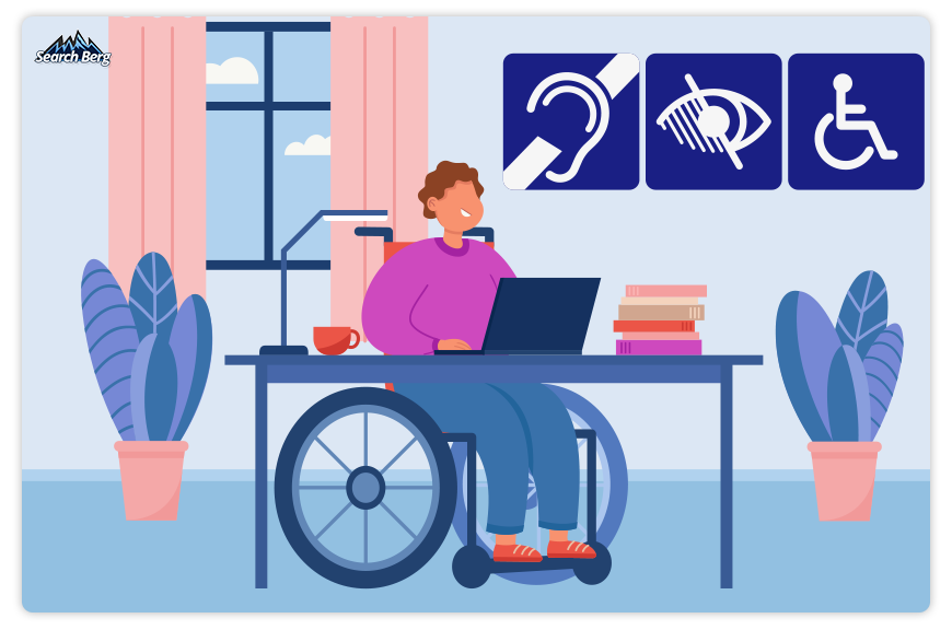
As we journey further into 2023, responsive web design is taking a decisive step towards inclusivity. Designing for accessibility is no longer an afterthought; it’s becoming a fundamental pillar of effective web design. And rightly so. After all, the internet is for everyone.
Designing for accessibility means creating websites that everyone can use, regardless of their physical, cognitive, or technological abilities. It’s about removing barriers and building bridges, ensuring the digital space is just as diverse, inclusive, and accessible as the world around us.
Think of it as a digital welcome mat for your website. Just as you would make a physical store accessible for all customers, your website should be navigable and usable by all visitors, including those with visual, auditory, motor, or cognitive impairments.
The key to accessible design is empathy and understanding. It involves appreciating the different ways people interact with the web and implementing design elements that cater to these varied needs.
This could include providing alternative text for images, ensuring sufficient color contrast for users with visual impairments, or designing intuitive navigation for people who use assistive technologies.
But why stop at mere functionality? Accessible design is also about delivering an engaging and delightful experience for all users! Your website shouldn’t just be usable; it should be enjoyable as well.
For instance, closed captions not only make videos accessible to deaf users but also enhance the viewing experience for users watching in a noisy environment or those who simply prefer reading along.
Designing for accessibility also carries SEO benefits! Search engines like Google appreciate websites that cater to a broad audience and have started considering accessibility as a ranking factor.
Moreover, many of the practices involved in creating an accessible website, such as semantic HTML and alt text, are also good for SEO. They help search engines understand your content better, potentially improving your website’s search rankings.
4. Case Study Corner: Success Stories in Web Design
4.1. Dropbox
Dropbox, the renowned file hosting service, has masterfully managed to harmonize innovative web design with effective SEO strategies. The driving force behind their SEO success? The company’s user-centric philosophy which reverberates through every element of itswebsite design.
4.1.1. Minimalistic Web Design
At first glance, Dropbox’s web design is the epitome of minimalism. It flaunts a clean and clutter-free interface that focuses on functionality. The text is crisp, the color scheme is soothing to the eyes, and there’s plenty of white space to balance the few design elements.
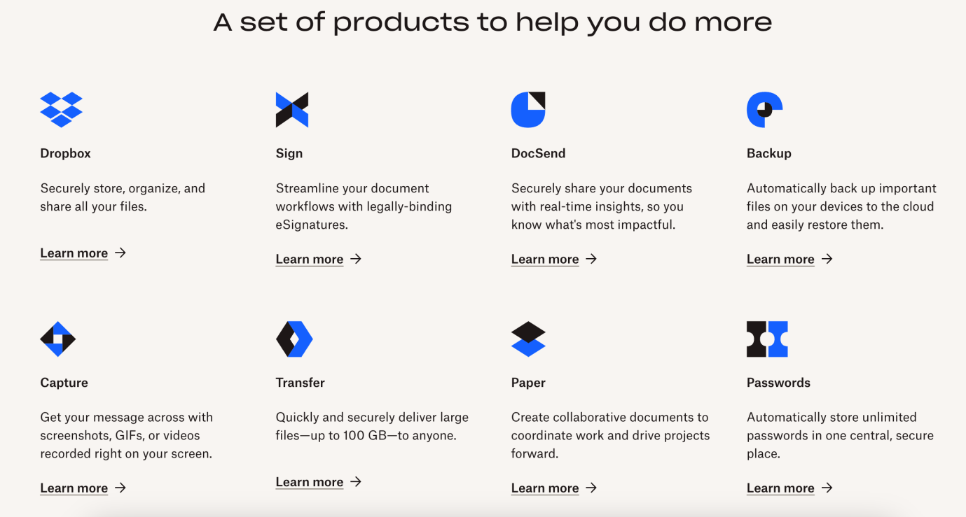
But beyond the aesthetic appeal, this minimalistic approach provides a swift and smooth user experience by improving site speed: a crucial ranking factor for search engines like Google. A fast-loading site not only pleases users but also gets the nod of approval from search engine algorithms.
4.1.2. Micro-Animations
Dropbox leverages the power of micro-animations to enhance user experience. Take, for example, the “drag and drop” feature. When you select a file to upload, an animation appears, showing that the file is ready to be moved to Dropbox.
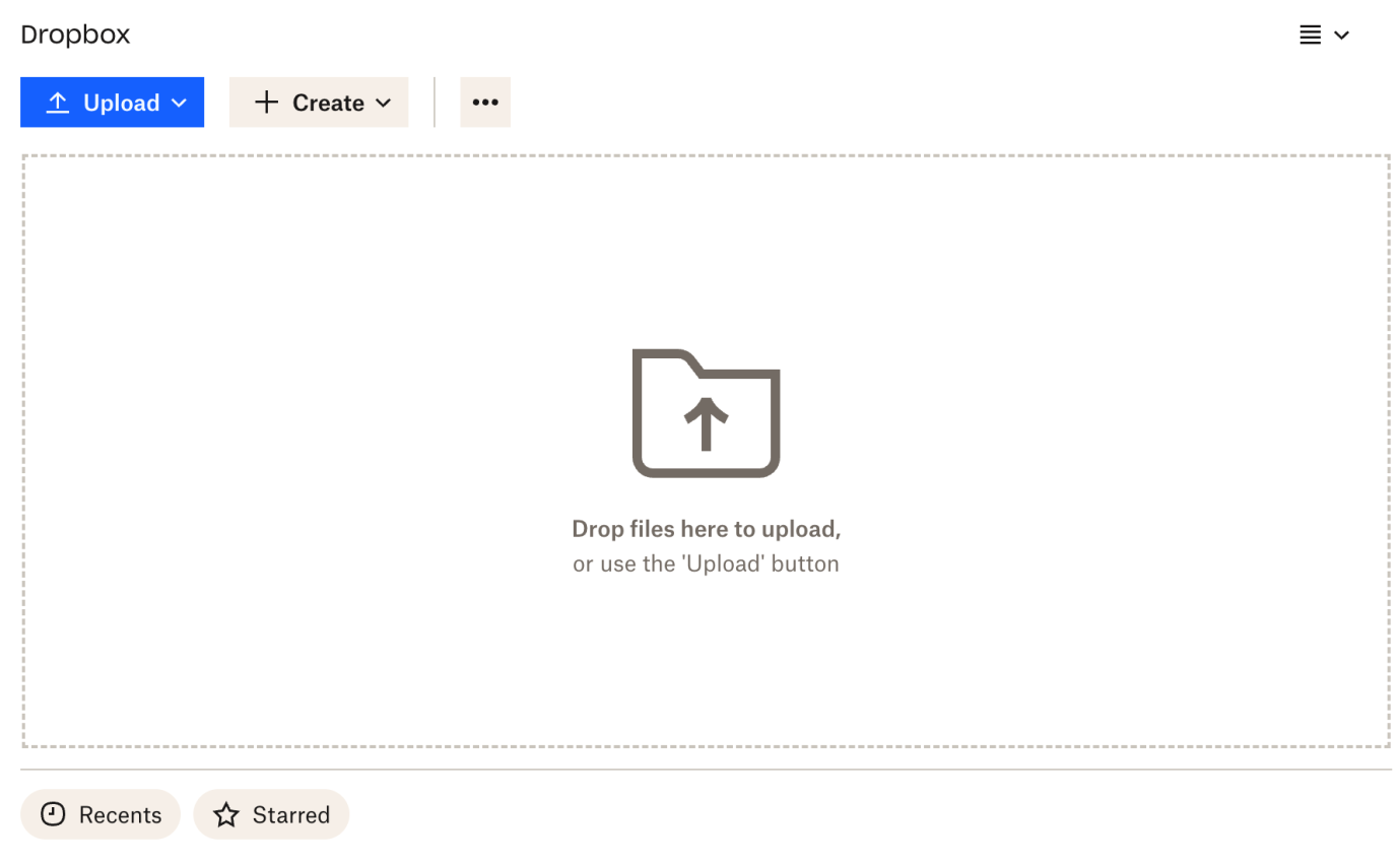
These micro-animations provide clear, visual guidance to users, making the platform more intuitive and engaging. By enhancing user experience and increasing the time spent on the site, these micro-animations indirectly boost SEO.
4.1.3. Accessible Design
Dropbox’s website is also a sterling example of accessibility in web design. It’s structured and organized in a way that’s not just user-friendly for those with disabilities but also easily crawlable for search engines.
Screen readers can effortlessly navigate the site, providing an inclusive experience for all users. This focus on accessibility sends positive signals to search engines, showcasing Dropbox’s commitment to providing a quality experience for every user.
All in all, Dropbox serves as a testament to the power of web design in enhancing SEO. By prioritizing user experience and accessibility and leveraging features like micro animations and efficient internal linking, Dropbox’s web design draws in users andimpresses search engines.
It’s a clear example of how innovative website design services can serve as a strong undercurrent for a successful SEO strategy.
4.2. Apple

Renowned for its sophisticated aesthetics and groundbreaking innovations, Apple’s web design mirrors the principles that the tech titan holds dear. The beauty of Apple’s website lies in its simplicity. With a clean, minimalistic design, Apple creates an online experience that’s as seamless and efficient as itsproducts.
4.2.1. Minimalism at Its Best
Apple’s design ethos gravitates towards minimalism. The website exhibits this through its clean lines, liberal use of white space, and judicious use of text.
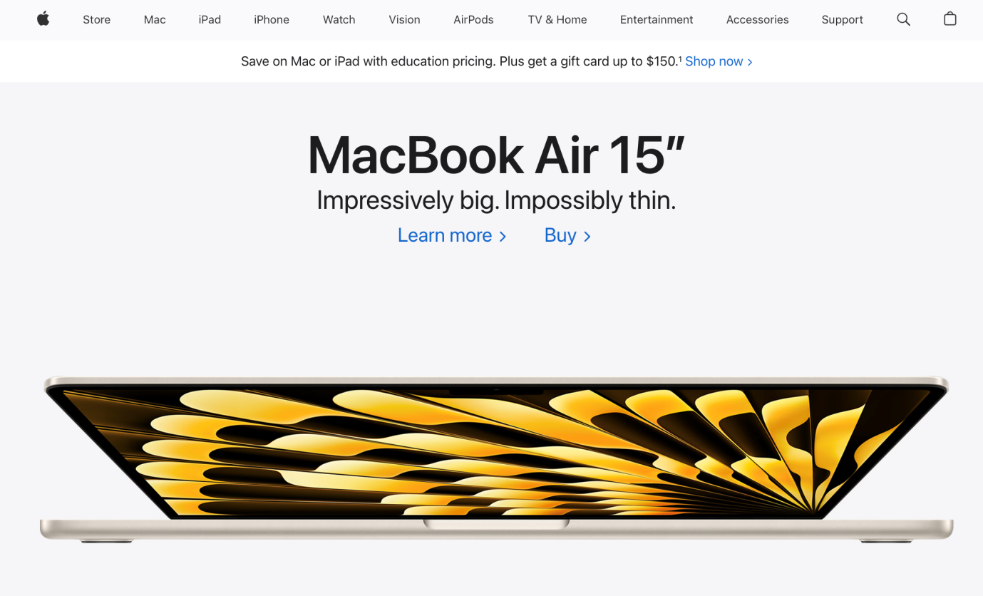
But beyond the visual appeal, this minimalistic approach serves a practical purpose. It makes the site swift to load and easy to navigate: key determinants of search engine rankings.
By keeping its website lightweight and clutter-free, Apple ensures visitors don’t have to wait for information. The outcome? A significant reduction in bounce rate and higher user engagement.
4.2.2. High-Quality Imagery and Alt Text
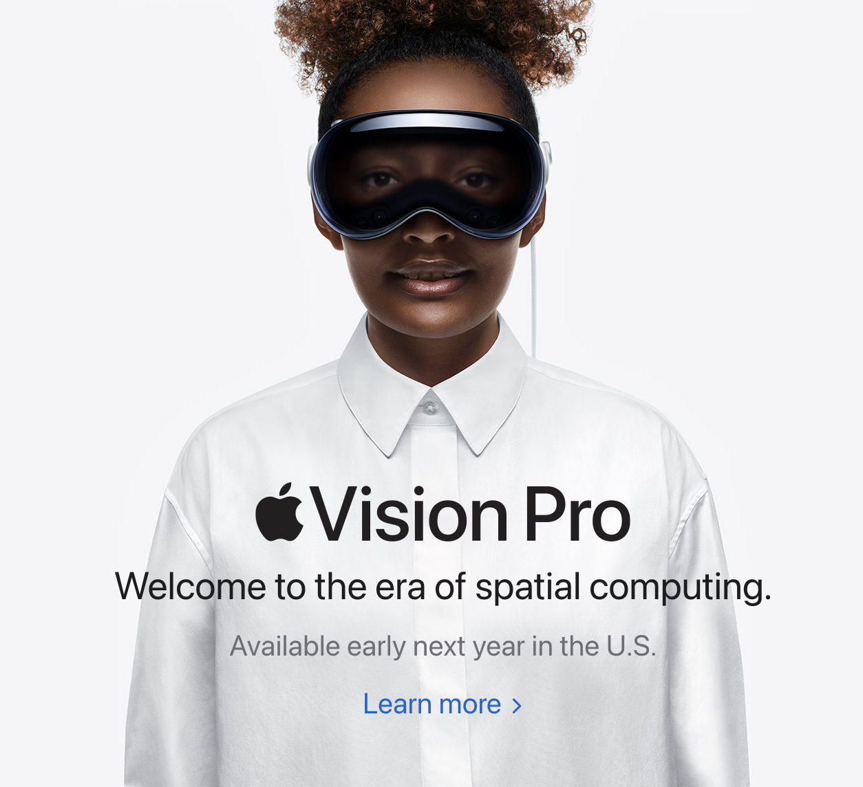
Another distinctive feature of Apple’s website is its extensive use of high-quality images. When combined with effective alt text, the images captive users and play a vital role in SEO.
Alt text helps search engines understand the content of images. As a result, it improves thesite’s visibility in image search resultsand enhances accessibility for visually impaired users.
4.2.3. Efficient Use of Breadcrumbs
Apple also uses breadcrumbs in its web design. These navigational aids provide users with a trail to follow back to the homepage, allowing them to understand the site’s structure and their current location within it.
From an SEO perspective, breadcrumbs enhance the crawlability of a website. They make it easier for search engines to understand and index the site’s content. By doing so, breadcrumbs contribute positively to the site’s search engine rankings.
4.2.4. Focused and Concise Content
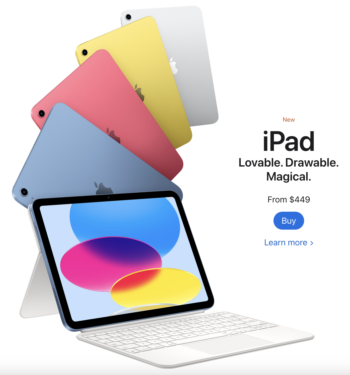
Every word on Apple’s website is carefully chosen. The content is concise and straight to the point, highlighting the product’s features and benefits without overwhelming users with information.
This focus on brevity and quality not only aligns with Apple’s overall design philosophy but also carries SEO benefits. Search engines value quality content, and by providing just that, Apple increases its chances of ranking higher on Google SERPs.
4.2.5. Dark Mode Design
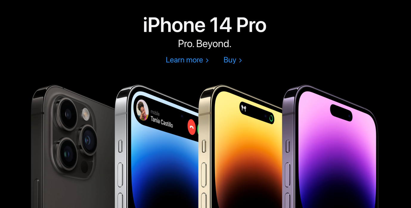
Apple’s command over aesthetics extends well into the realm of web design trends, including the use of dark mode design, a trend that has been taking the digital world by storm. Dark mode design offers a sleek, modern look that provides an immersive user experience, and, as always, Apple has incorporated this trend to perfection.
Apple’s dark mode design enhances visual ergonomics by reducing eye strain, especially in low light conditions, and potentially saving device energy (particularly with OLED screens). By integrating a dark mode option on itswebsite, Apple caters to a diverse user base, offering a user-centric approach that has always been an integral part of itsdesign philosophy.
4.3. Netflix

Netflix, the global streaming service, has carved its niche in the digital world not just with its content but also through its strategic use of web design for SEO. Its website is a testament to how responsive web design strategies can be tailored to deliver a highly personalized and visually engaging user experience.
4.3.1. AI-Driven Personalization
One of the standout features of Netflix’s web design is the use of AI for personalizing content recommendations. Netflix’s AI algorithms analyze the viewing habits and preferences of each user, tailoring the site’s content to offer a highly personalized experience.
This strategy keeps users engaged and on the site for extended periods, reducing bounce rates and increasing dwell time, both important factors for SEO. By providing content that directly appeals to users, Netflix ensures its audience remains hooked, thereby sending positive engagement signals to search engines.
4.3.2. Visually Engaging Design
Netflix’s web design heavily emphasizes visual engagement. High-definition images and interactive trailers dominate the site, offering users a sneak peek into the content.
This strategy, coupled with the correct use of alt tags, serves a dual purpose: it enhances user engagement and allows search engines to index the images, positively impacting Netflix’s SEO.
Netflix’s site navigation is intuitive and user-friendly, with clearly categorized content and a prominent search function. This ease of navigation improves user experience and, subsequently, user engagement metrics, both of which positively impact SEO.
By ensuring users can find what they want quickly and efficiently, Netflix keeps its audience engaged, which search engines interpret as a sign of a high-quality site.
4.3.4. Load Speed and Mobile Optimization
With the increasing shift towards mobile viewing, Netflix’s website design is responsive and optimized for various devices and screen sizes. This not only enhances user experience for mobile users but is also favored by Google’s mobile-first indexing.
Additionally, despite its high-quality visuals, Netflix’s website maintains a quick load speed, further improving user experience and SEO.
By using web design to enhance user experience and engagement, Netflix has managed to boost its SEO significantly. Its emphasis on AI-driven personalization, visually engaging design, user-friendly navigation, and mobile optimization showcases how web design can be used innovatively to improve SEO and ensure a high level of user engagement.
It stands as a shining example for businesses aiming to integrate their web design and SEO strategies successfully.
5. Search Berg: The Web Design and SEO Maestros
Just as a masterful chef understands the subtle art of blending ingredients to create a culinary masterpiece, our team at Search Berg excels in combining elements of web design to construct a website that’s attractive and SEO-friendly.
We understand that every business is unique, every audience is different, and every industry has its own set of norms. And it’s this understanding that allows us to provide custom web design services that resonate with your audience and help your business carve its niche.
Web design and SEO are like two sides of the same coin, and you need an expert to ensure that both sides shine equally bright. That’s our forte. We’ve been in the game long enough to know that it’s not about following trends blindly, but about picking the ones that align best with your business ethos and audience preferences.
Are you ready to get started? We’re excited to serve you! Explore our website design services and web design packages to determine what’s right for you. You can also speak with our website designers to develop a better understanding of Search Berg’s unique approach, strategies, level of personalization, and outputs. Let’s work together to make your website the crown jewel of your digital empire!


