The Role of SEO in Modern Web Design: How to Dominate SERPs
You’ve poured countless hours into your business. Each product meticulously chosen, every service honed to perfection, and a website that reflects your dedication and passion. Yet, every morning, you pull up your site’s analytics and come to the same sobering realization: you’re struggling to rank high on Google search engine result pages (SERPs).
Welcome to the struggle faced by countless small to medium-sized businesses in 2023–24. While it’s tempting to believe that captivating web design is enough, the truth is that a significant part of the battle is fought behind the scenes. It’s called SEO.
Search engine optimization (SEO) doesn’t just influence where you appear in search results; it determines whether you’re seen at all. And today, with so much riding on online visibility, can any business afford to overlook it?
But here’s the kicker: SEO isn’t just about peppering content with keywords. It’s deeply intertwined with the very structure, layout, and functionality of your website.
Join us as we delve deeper into the world of website design for SEO. We’ll understand the role of SEO in website design, discuss the best way to rank higher on SERPs by leveraging SEO-driven web design, and help you lead the digital race.
Are you with us?
Let’s begin!
Understanding Website Design for SEO
While standalone web design plays a critical role in creating a memorable first impression, there’s more beneath the surface that drives digital success.
Standalone web design focuses primarily on the visual aesthetics and user interface of a website.
However, even the most captivating designs can fall flat if they don’t meet the nuanced criteria used by search engines, like Google, to determine the value and relevance of a site.
Without proper optimization, a website can easily get lost in the vast sea of the internet, no matter how beautifully designed it may be.
This is where search engine optimization comes into play. SEO is the backbone of a website’s visibility. It encompasses a range of strategies and techniques geared toward making your website more accessible and understandable to search engines.
When a website is optimized effectively, it communicates its purpose and value to search engines. This, in turn, results in higher SERP rankings.
The connection between web design and SEO rankings is symbiotic. While the design determines how users interact with your site, SEO ensures that users find your site in the first place.
Think of it as a two-step process. First, SEO brings users to your digital doorstep, and then the design entices them to stay, explore, and engage. This is where web designers and SEO specialists join forces to achieve spectacular results.
But before the experts enter the picture, there’s a lot that you, a business owner, must grasp and implement.
The first step is understanding how to incorporate SEO in website design. Let’s show you the way!
Strategy 1: Mobile-First Indexing
Mobile-first indexing isn’t just a buzzword; it’s a directive from the digital overlords themselves: Google.
But what does it really entail?
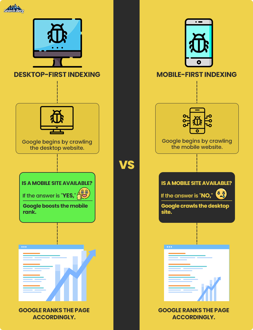
In the past, search engines viewed websites predominantly through the lens of a desktop user. This meant that when Google indexed (or cataloged) the content of a website and determined its rank, it used the desktop version of a site as its primary reference point.
However, with the meteoric rise in mobile browsing, Google made a strategic shift. Mobile-first indexing was born out of this transition.
It means that Google now uses the mobile version of a website as its primary source for indexing. In essence, Google evaluates the content, links, structured data, and other key SEO elements of the mobile version first, before the desktop version.
But why make this change?
It’s simple. Google’s main objective is to offer its users the most accurate and user-friendly results. As mobile browsing outpaced desktop, it became evident that a user’s experience on mobile was equally, if not more, crucial.
By switching to mobile-first indexing, Google ensures that its search results are aligned with the preferences and browsing habits of the majority of its users.
Now, don’t get us wrong, mobile-first indexing isn’t about excluding desktops; it’s about prioritizing mobile. As more users migrate to mobile devices for their browsing needs, this indexing strategy ensures that search results remain relevant, timely, and optimized for the modern user’s experience.
1.1. How to Incorporate Mobile Optimization Into Web Design for Better Rankings

Want to speedily climb SERPs by making the right web design changes? Let’s start with responsive website design for SEO.
A website that adjusts fluidly to any screen size, from smartphones to desktops, provides a consistent user experience.
Google is particularly fond of such sites.
Why?
Because they’re likely to retain users longer by reducing the bounce rate and bolstering dwell time (both pivotal factors that can determine your SERP rankings).
Your website should look impeccable and function without a hitch across all platforms; no questions asked.
Touch is a big part of the mobile experience. Your web design should be as touch-friendly as can be. Use adequately sized buttons and appropriately spaced links to prevent erroneous clicks.
When users can navigate your site effortlessly with their fingertips, they’re more likely to stay engaged.
We also recommend steering clear of irritants. For instance, pop-ups, though potentially effective on desktop, can be a thorn in the side for mobile users. They’re intrusive, and Google knows it.

Sites weighed down by cumbersome pop-ups, especially on mobile, may face penalties (which can affect their SERP standing). When it comes to web design for SEO, this is a big no (with some exceptions).
If you must use pop-ups, make sure they’re non-disruptive, easily dismissible, and limited to one pop-up per page. You don’t want a swarm of pop-ups annoying your audience and, more importantly, preventing them from accessing the content they really want to access.
When you’re working with a small smartphone screen, pop-ups aren’t as easy to close. And trust us, you don’t want to frustrate users like that.
Traditional websites use fixed-pixel layouts, but for a mobile-friendly site, adopting a fluid grid is beneficial. This means designing elements in relative units like percentages rather than fixed units like pixels.
As a result, your site’s layout will flexibly adjust itself relative to the screen’s size. The outcome? Consistent presentation across devices.
1.2. Mobile-First Web Design in Action
The Adidas website serves as a beacon of mobile website design excellence. Leveraging a user-centric approach, the brand ensures its massive global audience can access, browse, and shop with ease (regardless of the device they use).
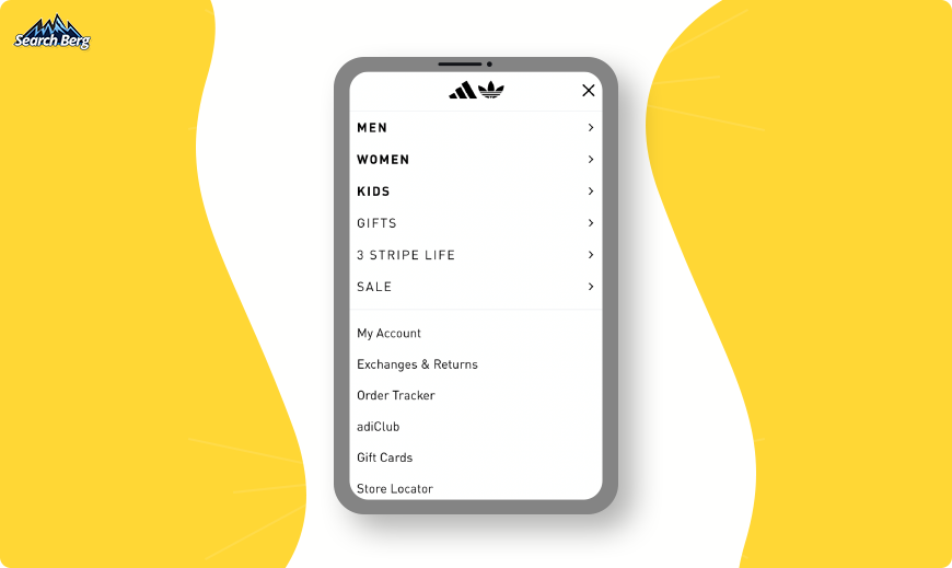
Upon landing on the Adidas mobile site, users are immediately greeted by a clean and minimalist design. The top of the page houses a simple hamburger menu (three horizontal lines), which, when tapped, unveils a well-organized list of categories and sub-categories.
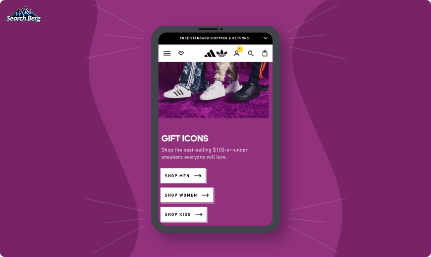
One of the hallmarks of an effective mobile-friendly website is adaptability. Adidas nails this by ensuring their site is responsive, meaning it automatically adjusts to fit any screen size, from smartphones to tablets.
Smartphone screens are limited in real estate, but Adidas maximizes this space with a sticky ‘Add to Cart’ button. As users scroll through product details, this button remains within their thumb’s reach, making the purchase process intuitive and reducing the steps to conversion.
While sticky elements don’t directly impact SEO, they enhance user experience. A seamless and intuitive shopping experience can reduce cart abandonment rates and increase conversions.
This is a great way to indirectly boost your site’s reputation and trustworthiness in the eyes of search engines. If you want to follow in Adidas’ footsteps, opt for professional website design and development services.
Strategy 2: Optimized Visual Elements
Launching a visually appealing website is akin to donning a tailored suit for an important meeting; it creates a memorable first impression.
Yet, aesthetics alone won’t secure the deal. Behind those sharp visuals must lie a strategy grounded in efficiency, user experience, and SERP optimization.
Let’s dive deep into the strategic importance of visual elements and how they intertwine with your website’s SEO prowess.
2.1. Picture Perfect: Compress Without Compromising
Aesthetically speaking, a high-definition image is a feast for the eyes. But on the web, this sumptuous visual meal can be the equivalent of a traffic jam during rush hour: slow and frustrating.
So, how does one serve a visual treat without clogging the digital highway?
The magic word is compression. Use tools like TinyPNG or JPEG Optimizer to reduce image file sizes dramatically without discernible loss in quality. This is a great way to speed up load times. You’ll manage to keep web users engaged and reduce the bounce rate.
(This isn’t the only way to speed things up. We’ll delve deeper into the art of site speed optimization in the next section.)
SEO Benefit: Google loves speed. Faster loading times, facilitated by compressed images, can significantly boost your site’s ranking.
2.2. Alt Text: The Unsung Hero of Accessibility (and SEO)

Every great image on your website should be backed up by equally great alt text. This is non-negotiable when it comes to website design for SEO.
This descriptor, invisible to the average user, narrates the content of the image for web users with visual impairments.
But there’s a dual purpose here. Alt text also provides search engines with context about the image and, in doing so, helps with indexing.
When crafting alt text, be concise yet descriptive. If you have an image of a golden retriever playing fetch in a park, the ideal alt text might be “golden retriever catching a ball in a sunlit park.”
SEO Benefit: Search engines crawl and index alt text. Well-phrased alt text can get your images (and your site) discovered more frequently. Who doesn’t want that?
2.3. Dynamic Vector Graphics: Scalability Meets Elegance
SVGs (scalable vector graphics) are a godsend for businesses. Unlike traditional image formats that can pixelate when resized, SVGs remain crisp and clear, regardless of the scale. This makes them perfect for logos and icons that need to appear flawlessly across devices of varying sizes.
SEO Benefit: SVGs load faster than their pixel-based counterparts. It’s also important to note that search engines can index the content of SVGs. This means that the text inside SVGs can be read and understood by search engines.
2.4. Lazy Loading: The Art of Patience
At a time when everyone (including Google) is obsessed with speed, “lazy” might sound counterintuitive.
But lazy loading is a technique where images only load as they’re needed (rather than all at once when a user first accesses a page). As users scroll down, the visuals appear just in time for viewing.
It’s like having a conveyor belt of appetizers that only serves treats when you’re ready to munch!
SEO Benefit: By reducing the initial load time of a page, lazy loading can make the use of resources more efficient and improve user experience.
Since user experience metrics influence rankings, keeping users on your site longer with smoother load times can have a positive impact on your SERP positioning.
Hire SEO services for lazy loading. While you can take the reins yourself, a team of experts will ensure that lazy loading is implemented in a way that maximizes both speed and user experience.
Strategy 3: Site Speed Optimization

Patience isn’t just a virtue; it’s a rare commodity.
Picture a user tapping into your website, drumming their fingers, waiting, waiting a bit more… and waiting even more. Before you know it, they’ve hit the back button.
Site speed isn’t just a tech metric; it’s a first impression. It’s pivotal for user experience and, by extension, for your SEO ranking.
Slow load times are the digital world’s version of a drawn-out, uninspiring, and monotonous monologue. Let’s make sure your website gives a captivating performance!
3.1. Why Speed Matters in SEO
Search engines, with Google at the forefront, have one primary goal: to offer users the most relevant and efficient experience possible.
Page speed became an official Google ranking factor for mobile searches in July 2018, and its importance has only grown since.
A faster site can lead to:
- Improved User Experience: When a page loads quickly, users find what they need without delay.
- Higher Engagement Metrics: Faster sites often have a lower bounce rate and longer session duration.
- Increased Conversions: Speed can directly influence eCommerce sales, sign-ups, and other conversion metrics.
3.2. Revving Up Your Website: Speed Optimization Strategies
- Leverage Browser Caching: When users visit your site, caching can store some files on their device for a set period. On subsequent visits, this means less data needs to be loaded, thus increasing speed.
- Minimize HTTP Requests: Each element on a page (images, scripts, stylesheets) requires a separate HTTP request. By reducing these elements (e.g., using CSS instead of images or merging multiple style sheets), you can speed up load times.
- Use Content Distribution Networks (CDNs): CDNs distribute your site’s files across a network of global servers. Users receive files from the nearest server, ensuring quicker load times, especially for international audiences.
- Optimize CSS and JavaScript: Minifying (removing unnecessary characters without changing functionality) and compressing these files can lead to sizeable speed improvements.
- Prioritize Above-the-Fold Content: Ensure the content appearing first (before a user scrolls) loads the fastest. This gives the illusion of quicker overall page loading and enhances user experience.
3.3. Speed Metrics at a Glance
If you want to integrate SEO in website design and dominate Google SERPs, understanding speed metrics is your ticket to success. It’s like having a compass in the wilderness of the digital world; without it, you’re bound to get lost.
Google knows that a happy user is a loyal user. Speed metrics directly affect user experience. If your website is slow to load or navigate, visitors are likely to bounce off faster than you can say “click.” Understanding these metrics allows you to fine-tune your design for a smoother user journey.
And then there’s Google’s obsession with speed. It wants to deliver the best results to its users; that means favoring websites that load swiftly and efficiently.
If you want Google to give your website a nod of approval, you better speak its language, and that language is speed.
Here are the most pivotal metrics you should keep an eye on:
| Metric | Description | SEO Impact | Optimization Strategy |
| First Contentful Paint (FCP) | Time taken for the first piece of content to appear on the screen. Click here for a detailed description. | Affects user experience. | Optimize CSS, use efficient font loading, and minimize server response times. |
| Time to Interactive (TTI) | Measures the time from when the page starts loading to when its main sub-resources have loaded, and it responds to user interactions in an acceptable time. Click here for a detailed description. | Longer TTI can lead to increased bounces. | Use browser caching, remove non-essential third-party scripts, and minimize main-thread work. |
| Speed Index | Represents how quickly the contents of a page are visibly populated. | Indirectly impacts user experience by providing a perception of speed. | Optimize critical rendering path, reduce server response times, and prioritize visible content. |
| Total Blocking Time (TBT) | Quantifies the total amount of time when the main thread was blocked for long enough to prevent input responsiveness. Click here for a detailed description. | Delays can frustrate users and lower engagement. | Break up long tasks, and optimize your page for interaction readiness. |
| Largest Contentful Paint (LCP) | The time taken for the largest image or block of text to appear in the user’s viewport. Click here for a detailed description. | Slow LCP can discourage user engagement and increase the bounce rate. | Optimize image sizes, serve images in next-gen formats, and utilize CDNs for faster delivery. |
Armed with these metrics, businesses can refine and sharpen their website performance.
How?
Let’s consider the example of a hypothetical online bookstore (we’ll call it “Readers’ Haven”). The business notices that despite offering a well-curated selection of titles and a visually appealing website, they’re still experiencing a higher bounce rate than industry norms. Intrigued and concerned, their team decides to investigate. Their web analytics point to a slower-than-average first contentful paint (FCP).
Upon seeing the lag in FCP, Readers’ Haven understands that the first visual elements are taking too long to appear on users’ screens. This means that prospective customers are left staring at a blank or loading screen. Their first impression is marred.
To resolve this, Readers’ Haven optimizes their website’s CSS, streamlines the number of elements that load initially, and defers non-essential JavaScript files.
After implementing these changes, they observe that their FCP times improve significantly. This lowers their bounce rate and improves their SEO rankings.
See how this works?
The remaining metrics are just as useful. When leveraged correctly, they can help you make the right website design and development changes to secure loftier SERP rankings. Turn to professional SEO services to make good use of speed metrics.
Strategy 4: Strategic Keyword Placement
When we talk about website design for SEO, keywords may not be the first thing that pops into your mind. You’re more likely to ponder color schemes, layout, and UX/UI elements.
But guess what? Strategic keyword placement is just as much a part of your website’s design as swanky graphics. In fact, keyword placement in design can amplify your SEO mojo, making you the catnip to Google’s finicky algorithms!
Now, we’re not talking about stuffing your website with keywords like a Thanksgiving turkey. That’s so early 2000s, and Google’s gotten smarter since then.
What we’re discussing is an artful integration of keywords into design elements that boosts your SERP rankings and masterfully enriches the user experience.
Let’s show you the way.
4.1. Header Tags: More Than Just a Typeface
Ah, header tags, the underestimated guardians of both your website’s visual narrative and its SEO potential.
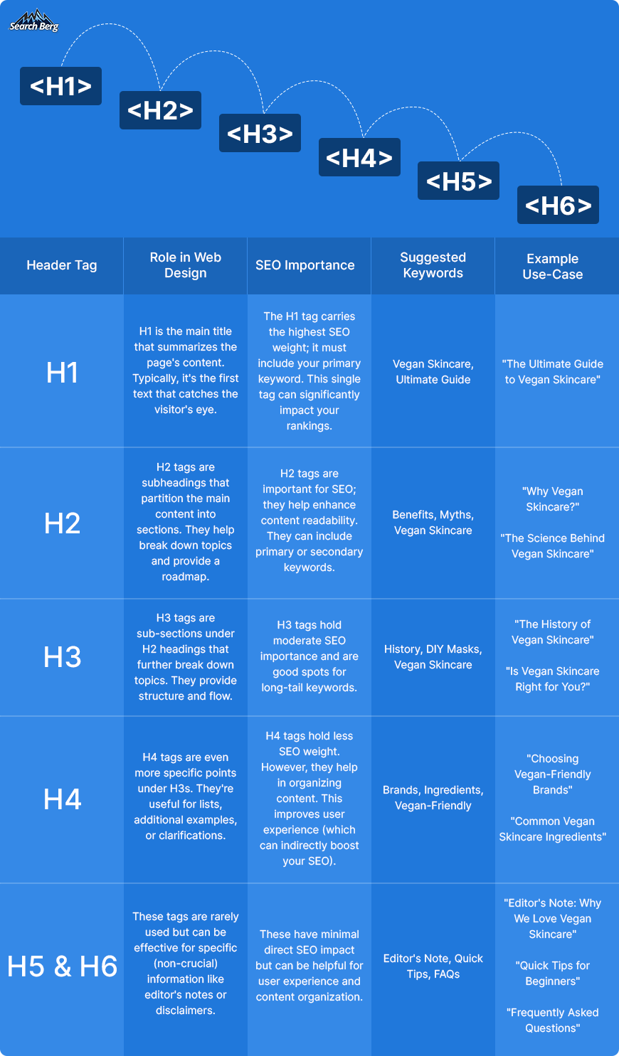
When you’re setting up your webpage, the way you style your headers (H1, H2, H3, and so on) does more than just make your text look good. Each tag serves as an indicator; think of it as a virtual neon sign that tells search engines what each section of your content is about.
Now, you may wonder why Google even bothers to scrutinize your headers. The answer is simple: relevance and structure.
By nesting your chosen keywords strategically within these tags, you’re essentially underlining them for Google’s search algorithms, saying, “This is important; pay attention to it!”
This is particularly critical for your H1 tag (often the first text that a search engine will crawl on your webpage). Inserting your main keyword into the H1 tag can be an SEO game-changer. This approach tells search engines what your page is fundamentally about.
But let’s not overlook the other headers (H2, H3, etc.) that offer a chance for secondary and long-tail keyword placement. While they may not carry as much weight as H1, these subsequent headers reinforce your page’s topical focus, leading to better topical alignment and potentially improved rankings.
Creatively integrate keywords into your headers without making them look forced or robotic. We like to think of this as a blend of art and science. You don’t want to disrupt the reader’s experience by jamming in awkwardly-placed keywords.
The goal is for the keywords to flow naturally and make sense to human visitors. Check these boxes off the list, and you’ll manage to draw nods of approval from search algorithms!
When done right, header tags offer an SEO double whammy: they enhance user experience by making content digestible and guide search engines through your content’s structure.
In the grand scheme of web design for SEO, taking the time to optimize your header tags can be one of the smartest moves in the game.
We’ve done a lot of talking.
Let’s walk the talk now.
4.2. CTAs and Buttons
Calls to action (CTAs) and buttons are like the psychological nudge and the physical click that seal the deal.
While you may not immediately associate them with SEO, they’re actually connected in a few surprising ways.
First off, the text in a button or CTA can itself be an opportunity for keyword placement. Although the SEO impact here isn’t massive, every bit counts.
The second way CTAs and buttons contribute to SEO is by enhancing user experience (UX). If you’ve designed your CTAs effectively, users are more likely to spend more time on your site and explore it further. This on-site behavior can indirectly influence your site’s search engine rankings.
Google appreciates sites that visitors appreciate, and this favorable interaction can translate to a bump in your SERP positioning.
Lastly, CTAs that lead to high-quality, keyword-rich landing pages can be a roundabout way to boost your SEO. If your “Get Started” button takes the user to a page that’s a goldmine of well-organized, relevant content, then you’ve created a backdoor for SEO enrichment!
When designing your CTAs and buttons, think of them as small but mighty warriors in your SEO arsenal. Their presence may seem straightforward, but their implications for SEO are multi-dimensional.
Choose your words carefully, position them strategically, and watch them become small clickways to big rankings.
The footer is a fantastic place to incorporate a lot of your site’s essential information. The best part? It appears on every single page. That’s prime real estate for your SEO goals!
A well-optimized footer can actually help you hoist the anchor and sail smoothly through the choppy waters of Google rankings.
For starters, footer navigation is excellent for internal linking, one of SEO’s best friends. By placing links to your main pages, you’re essentially telling search engines about the structure and hierarchy of your site.
This approach helps Google’s crawlers index your content more efficiently. The outcome? Sweeter SERP rankings. You’ll also make life much easier for human visitors by offering them a one-stop directory of all of your content!
While some SEO enthusiasts caution against keyword stuffing in the footer, intelligent and relevant use of keywords in footer links or descriptions can indeed help, not hurt.
Just keep it relevant and user-focused. Irrelevant links or keyword-stuffing could trigger Google penalties, and we don’t want that, do we?
Footers can also host social media buttons for that added SEO push via social signals. Though the direct impact of social signals (social media activity) on SEO is still a matter of debate, they do amplify visibility, and more visibility can lead to more backlinks!
Strategy 5: Visual Hierarchy
Visual hierarchy is like the Oprah Winfrey of web design for SEO; it steers the show, sets the pace, and makes sure everyone knows where to look.
“You get attention! You get attention! Everybody gets attention!”
But the magic lies in doling out the spotlight in just the right doses to the right elements. And guess what? This showbiz of prioritization isn’t just eye candy; it’s SEO gold.
Think about it. When visitors land on your page, their eyes naturally dart around like pinballs. A well-designed visual hierarchy can serve as the flippers guiding that pinball exactly where you want it to go. Maybe it’s to your latest blog or a shiny “Subscribe Now” button.
This isn’t just good for user experience; it’s great for keeping people on your site longer, reducing the bounce rate, and indirectly sending happy signals to our ever-judgmental friend, Google.
The longer visitors stay, the more valuable your site appears to search engines, boosting your SEO juice.
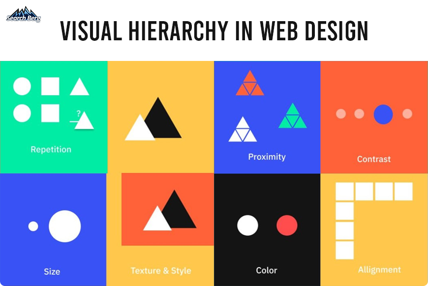
So, what tools do you have at your disposal for this visual wizardry? Size, color, contrast, alignment, proximity, and repetition are some of your go-to design elements here.
Use bold, large, attention-grabbing fonts for headlines to capture initial attention and smaller fonts for secondary information. This initial capture of attention isn’t just for aesthetics; it’s a calculated move to immediately tell search engines and users alike what your content is about.
Google loves well-structured content. When your headlines are descriptive and incorporate target keywords, you’re sending a strong signal to Google about the main topics on your page. When both human eyes and Google’s algorithms agree on the importance of your headlines, you’re onto something.
Now, let’s talk about contrast. If your button is a pale whisper against a light background, you’re doing things wrong. Even if users wanted to click, they’d need a magnifying glass to find it!
However, a button with contrasting colors screams, “Look at me! Click me!” High-contrast elements are eye magnets and can dramatically increase click-through rates. This boost in engagement tells search engines that your site offers a fulfilling user experience (which can positively affect your rankings).
And then we have white space. We like to call it the Marie Kondo of web design for SEO. It declutters your page and allows the most vital elements to truly shine!
But it’s not just about aesthetics. White space can significantly improve user comprehension rates by guiding visitors’ eyes naturally from one section to another. This increased readability and enhanced user experience make your site more “sticky” and ultimately reduces your bounce rate.
Let’s not forget about the F-pattern and Z-pattern reading paths that are commonly followed by users. F-patterns are great for text-heavy pages like blogs; Z-patterns work well for sites that are more visual.
By understanding how eyes move across a screen, you can strategically place critical elements (e.g., keywords, links, or CTAs) in these hotspots. Google’s crawler bots are incredibly sophisticated, but they appreciate it when you make their job easier by logically organizing your content!
Strategy 6: Structured Data and Schema Markup
So, you’ve baked the perfect website: crisp design, gooey content, and a dash of keywords. You may think you’re ready to serve this digital delicacy to the world.
But wait. There’s a secret ingredient you might be missing: structured data and schema markup.
They’re the icing and sprinkles that not only make your site look good to search engines but also help it taste better on SERPs!
Let’s demystify these terms.
Structured data is essentially a way to categorize the content on your page so that search engines can understand it better. Think of it as teaching Google your website’s language.
Schema markup, on the other hand, is a specific vocabulary of tags (or microdata) that you can add to your HTML to improve the way your page is displayed on SERPs.
For example, it can help transform a mundane search result into a rich snippet, complete with star ratings, images, and other eye-catching elements.
Why is this important for SEO?
Because Google loves understanding things.
The more Google understands your website, the more likely it is to recommend it to someone who’s searching. Structured data and schema markup essentially serve as a roadmap that leads Google straight to the treasure: your content.
So, how do you put this strategy into action in your web design?
- Identify Opportunities for Structured Data: Go through your website and look for elements that can benefit from structured data. This could be articles, reviews, events, and products. Each of these elements has specific attributes that can be marked up.
- Implement Schema Markup: Various online tools can generate schema markup for you. All you need to do is fill in your information. The tool will spit out HTML code that you can then paste into your webpage.
- Test Your Markup: Google’s Schema Markup Testing Tool is your go-to friend here. Always test to ensure you’ve implemented your markup correctly.
The game doesn’t end here. You see, structured data isn’t just a one-time project. As you add new content, keep updating your structured data accordingly. It’s like maintaining a garden; the more care you put into it, the more bountiful your harvest (or, in this case, search rankings).
Schema markup and structured data may sound like the “techy stuff” you’d rather avoid, but when it comes to modern web design, they’re the hidden gears that can drive your site to the top of search engine results. Trust us, they’re worth every byte!
If it’s too much for you, slow down, and let the pros handle it. Work with a team of web designers and SEO specialists who can take the reins for you. A power-packed web design and development package that harnesses the power of SEO will help you keep Google happy!
Strategy 7: Internal Linking with Intent
We touched upon this earlier. In this section, we’ll delve deeper.
Internal linking, when done with intent, helps users navigate your website easily and signals to search engines that you have valuable content worth showing off.
But what exactly is “internal linking with intent”? It’s the calculated art of linking pages within your website in a way that’s beneficial for both SEO and user experience.
Google’s algorithm can be demanding. Instead of just creating a bunch of links within your site, you put greater emphasis on the relevance and strategic alignment of those links.
7.1. It’s All About the User Journey
Think of your internal links as signposts. They should guide web users naturally from one point of interest to another.
For instance, if someone lands on a blog titled “The Best Ways to Brew Coffee,” the content should have some valuable internal links that guide them to your coffee makers or a review about the best coffee beans.
Internal links serve as a smooth transition; they keep users engaged, reduce the bounce rate, and increase time spent on your site (two metrics that Google absolutely adores).
7.2. Anchor Text and Context
Ah, the power of words! Your anchor text (the clickable text in a hyperlink) needs to be spot-on.
Use clear, descriptive, and straightforward language that entices clicks and gives search engines a clue about the linked content.
In other words, don’t just lazily link the word “here”; make it count by linking to descriptive text like “our ultimate guide to gourmet coffee.”
Also, try to keep it natural within the content; nothing screams “forced SEO strategy” like awkwardly placed anchor text.
7.3. Linking Hierarchies and Content Silos
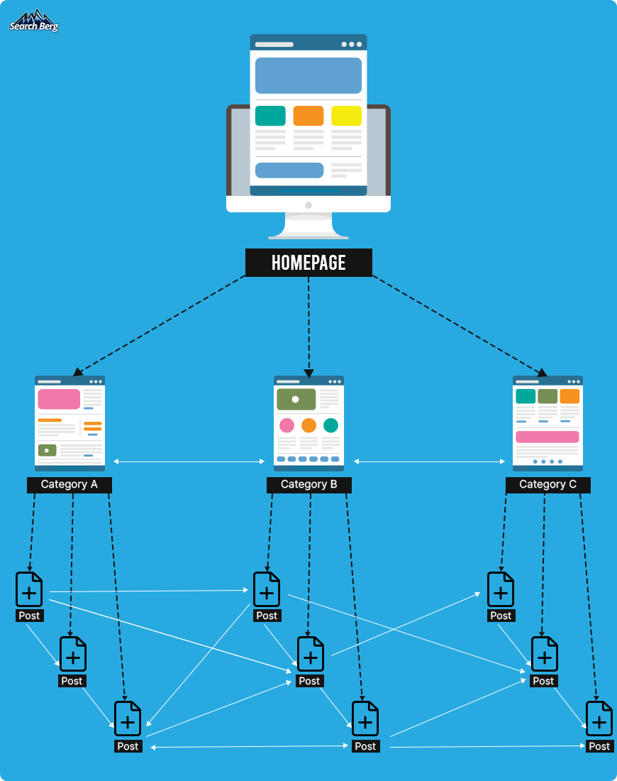
All internal links aren’t the same. You should have a clear hierarchy in mind.
Your homepage will naturally have the most authority (it gets the most external links). From there, determine the most important category pages or cornerstone content. Prioritize these in your internal linking game plan.
This is often termed as building ‘content silos’; it’s a way of telling search engines what content you consider most critical.
7.4. The Rule of Crawl Budget
“Crawl budget” might sound like something from a sci-fi flick, but it’s actually the number of pages Googlebot will crawl on your site within a given timeframe.
Why should you care?
Well, Google may not crawl all the pages on your site, especially if you have a large site. Strategic internal linking ensures that Googlebot spends its crawl budget wisely and indexes the most important pages.
Think of internal linking as your website’s neural network. Each link is a synapse that enhances user experience and juices up your SEO score.
It’s not just about throwing in a bunch of hyperlinks; it’s about connecting the right dots to create a coherent, enjoyable, and highly discoverable digital tapestry.
And who doesn’t want their website to be both web users’ paradise and Google’s darling?
Strategy 8: SSL and Website Security

SSL (secure sockets layer) is the silent yet critical player in web design you didn’t know you needed. We get it; it may seem like a technical afterthought, but SSL is what keeps the data between your website and its visitors secure.
This may sound like a job for the IT department at first. But from a web design perspective, integrating SSL has profound implications for your site’s search engine optimization performance.
Let’s dive into the what, why, and how.
8.1. The Subtle Signal of Professionalism in Design
The incorporation of SSL doesn’t just add a technical layer of security to your site; it also subtly yet powerfully contributes to the site’s professionalism and trustworthiness.
When visitors see “https://” in your website’s URL and the padlock symbol next to it, an immediate sense of credibility is established.
The modern consumer isn’t stupid; they’re savvy. They know that this small but crucial detail signifies a secure environment, which, in turn, signals that you’re running a trustworthy business.
From a web design perspective, this detail matters immensely. Your website serves as your digital storefront. Just as you would install a high-quality lock on a physical store to assure customers that it’s a safe space, SSL serves a similar function online.
Even if your website is flawlessly designed with jaw-dropping visuals and intuitive navigation, failing to include SSL undermines that effort, much like a beautiful shop with a broken lock. It’s akin to wearing a tailored suit but forgetting to shine your shoes. People will notice. And your first impression may take a hit.
When you’re carefully choosing color schemes, typography, and layout designs for your website, don’t forget to include SSL in your design blueprint. It’s a minor detail with major implications (both for user perception and SEO). It plays an integral part in the holistic experience you’re creating for both your human visitors and the search engine bots evaluating your site.
8.2. Google Cares About That ‘S’
Let’s get down to brass tacks. Google cares about SSL. Since 2014, HTTPS has been a ranking factor. Even before that, it was pretty clear that the search engine giant had a soft spot for secure websites.
Why?
Because Google’s primary goal is to provide its users with the most relevant and highest-quality results. And part of that quality is determined by user safety.
When your website is secure, you’re making Google’s job easier, and Google tends to reward that kind of behavior.
If you’ve invested time and resources into making your website a well-designed masterpiece, skimping on SSL is like buying a Ferrari but opting for the cheapest brakes.
Your site may look good, no doubt about it, but it’s missing a critical component that could affect its overall performance.
And the repercussions could be severe: studies have shown that as much as 85% of online shoppers would abandon a purchase if they realized the website wasn’t secure. No matter how good your products are, how great your services may be, or how visually appealing your website is, without that ‘S’ in your URL, you’re essentially setting up roadblocks on your own pathway to the top of the SERPs.
Strategy 9: Clean Code Practices

When we talk about clean code practices, many people conjure up images of programmers deep in concentration, churning out lines of incomprehensible script.
While that’s partially true, what often gets overlooked is the intimate relationship between clean code and excellent web design for SEO. Trust us; it’s a match made in digital heaven.
Imagine walking into a beautifully designed store where everything looks stunning, but nothing is labeled, and the inventory is scattered in a chaotic mess.
You’d probably walk right out, wouldn’t you?
In the same way, search engines would prefer not to index a beautifully designed website with messy code.
Clean code is like that store’s organizational system. It ensures everything is where it should be. In doing so, it makes it easier for search engines to crawl, understand, and index your website. That, in turn, boosts your SERP rankings.
But let’s not stop there. Clean code also contributes to quicker page loading times. Sloppy, redundant code can cause delays in how quickly your stunning visual elements appear to the end-user.
In today’s world of 5G and fiber-optic broadband, nobody’s got time for slow websites. And neither does Google. Speed is a ranking factor, so the faster your website, the better your chances of ranking higher.
And let’s not forget that well-structured code is also easier to update and maintain. Web design is never static; it’s a fluid, ongoing process. Trends change, businesses evolve, and your website should reflect that.
With clean code, making those tweaks and updates becomes far less painful, letting you adapt and keep up with design trends without losing sleep (or rankings).
How can you go about cleaning up your code? Instead of taking things into your own hands, hire SEO services. A team of professionals is your best bet; they’ll optimize your code to its sleekest version by removing unnecessary elements and enhancing the efficiency of your site.
Search engine optimization experts dig deep into the HTML, CSS, and JavaScript that make up your website. They eliminate redundant tags, white spaces, and inline styling.
They also tackle more complicated tasks like optimizing your CSS and JavaScript files by minifying and compressing them.
Another plus side of having a professional clean up your code? It’s far more future-proof. As we’ve mentioned, web design is an ever-evolving field. A well-coded website is far easier to update and adapt (whether you’re looking to change the color scheme or revamp the entire layout). It makes your website more flexible and ready to pivot.
Let’s not forget about accessibility. Clean code naturally lends itself to a more accessible website. When your code is clean and properly structured, assistive technologies like screen readers can interpret your content with greater ease. This opens up your website to a broader audience.
The next time you’re itching to spruce up your web design, remember that under the hood, the engine needs to be as sleek as the paint job. Professional SEO services will transform your site from just a pretty face into a pretty face and a well-oiled machine geared to climb SERPs.
Strategy 10: Regular Site Audits

Are you ready to lift the hood and peek into your website’s engine? Excellent, because it’s time for regular site audits, the equivalent of your car’s routine check-up.
A website isn’t a “set it and forget it” game; it’s a living entity in the digital ecosystem. In other words, if you’re not regularly auditing your website, you’re like a ship’s captain who never checks for leaks.
And let’s face it, nobody wants to be the captain of a sinking ship, especially when it’s your business on the line.
A site audit is essentially a full health check-up for your website. It focuses on your site’s performance, user experience, and, yes, SEO.
This periodic evaluation helps you identify both the strengths and weaknesses in your web design and SEO strategy.
It’s important to note that Google is constantly updating its algorithms. Your top-ranking website today may not hold its position tomorrow if you’re not keeping up.
In fact, Google could be rolling out an update as you read this; no pressure!
So, what does a site audit involve? You’ll be examining key elements like your site’s loading speed, mobile-friendliness, URL structures, internal and external links, and much more. These are critical components of SEO in web design.
Audit tools can flag issues like broken links, outdated content, or even penalties that you may not be aware of.
And let’s not forget about content. Content may be king, but even monarchs need a reality check once in a while. An audit can reveal whether your content is still relevant, optimized, and adding value to your audience. If it’s just occupying digital space and needs a refresh, you’ll be alerted.
The icing on the cake? A regular site audit allows you to keep tabs on your competition. By evaluating your site’s performance against industry benchmarks, you gain invaluable insights into where you stand in your market landscape.
Maybe your competitors have faster page loading times. Or perhaps they’re neglecting mobile optimization. Either way, these insights are golden opportunities for you to pull ahead. Your SERP rankings will thank you!
Start Ranking with Search Berg!
Congratulations, you’ve just navigated the maze of SEO in web design like a pro!
But here’s the deal: reading about SEO and web design is one thing; implementing these strategies is quite another.
Whether you’re a startup owner elbow-deep in entrepreneurial challenges or the busy manager of an SMB, mastering the arcane art of SEO-friendly web design may not be at the top of your to-do list.
But it should be.
After all, what’s the point of having a fabulous website if no one sees it?
That’s where we come in. At Search Berg, we’re not just search engine optimization experts; we’re your comprehensive digital partners. We can help you strategize, implement, and maintain a web design that doesn’t just look good but also ranks well on Google.
And don’t worry; you won’t have to spend endless hours worrying about SSL certificates, mobile optimization, or whether your alt text is doing its job. We’ve got it all covered.
We have the expertise to fine-tune every little cog in your digital machinery. The result? A harmonious web presence that pleases both human users and search engine bots. Our goal is to push you closer to that coveted #1 spot on Google’s SERPs!
Are you ready to move forward with Search Berg? Explore our expert SEO services to get started! We also provide web design and development services to businesses across the globe. By incorporating SEO in website design, we help you wow your audience and Google at the same time. Let’s get started!


